Helping a family business track projects more efficiently
2024
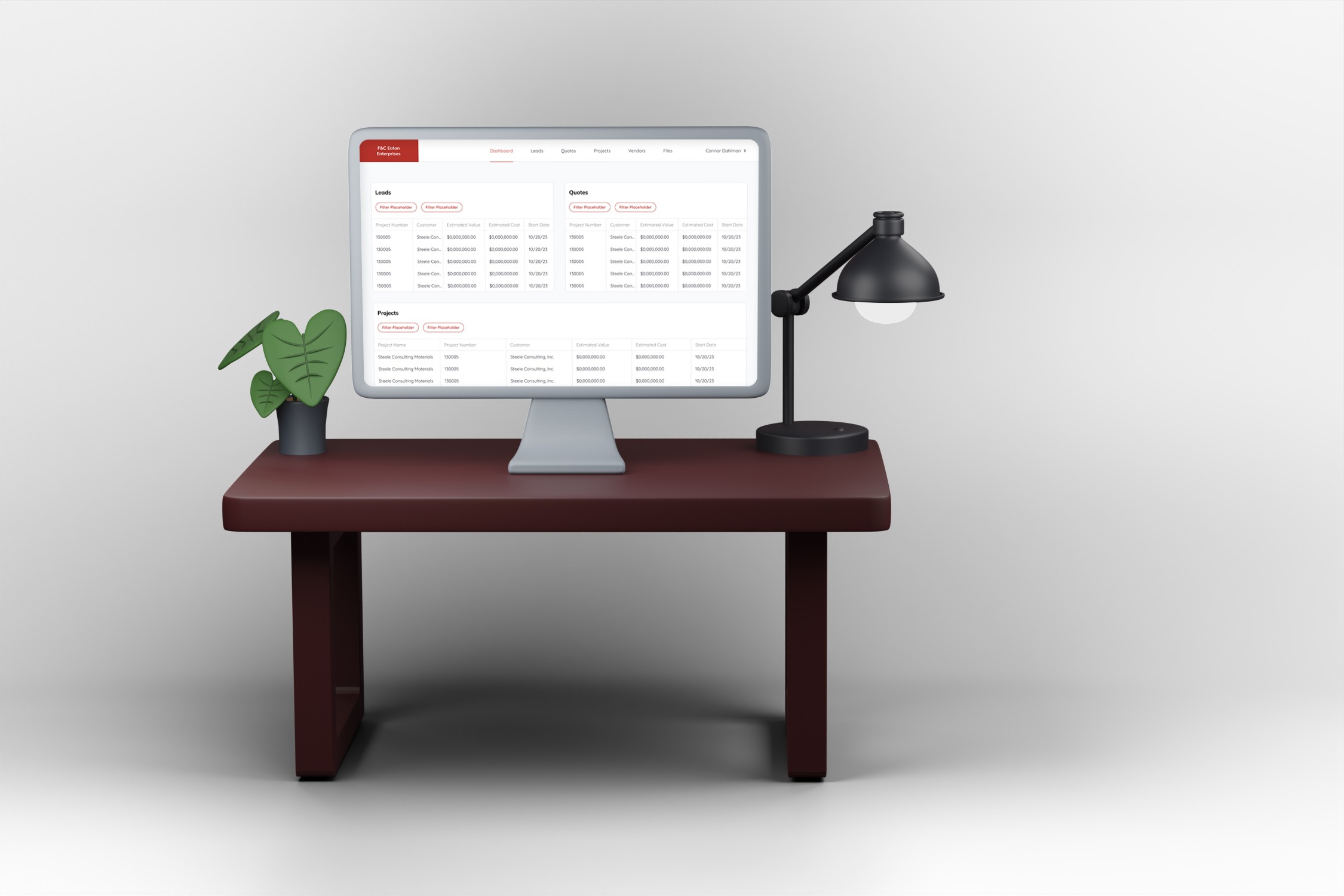
The folks at F&C Eaton needed help managing their projects
F&C Eaton was in need of a tool where they could track their projects, purchase orders, inventory, clients, and timelines. Before, they were filling out paper forms and using excel to track everything. They came to Steele so we could make a program that vastly increases employee efficiency when tracking and updating projects.
F&C Eaton’s work process was slow, and employees were spending too much time looking through, organizing, and updating project information in Excel.
I designed a B2B tool that will allow F&C employees to track and manage their projects, clients, and vendors
I designed a B2B tool that allows F&C Eaton employees to track the progress of their ongoing projects, organize their projects, track purchases and inventory, and manage client information.
Project page

THE DELIVERABLES
Grayscale Wireframes
Hifi Prototypes
Screen Mocks
THE COMPANIES
Steele Consulting Inc: My employer where I worked as Product Design consultant.
F&C Eaton: My client, a small, family owned business that provides construction materials, supplies, and equipment to their clients, which consist of medium to large construction businesses and government entities.
Wireframes 1, 2, & 3
By the time I joined the project, the developers had gathered basic information from the client, and I was told they wanted a way to store projects they’ve worked on in a sort of database. I later found out they needed to track their projects through the entire project lifecycle, but my first wireframe was based on the idea that they just wanted to store projects online.
I initially designed a basic grid-based UI that would allow them to add and edit projects at different states in the process. I presented this version of the designs to gather feedback and take suggestions for future iterations.
The first stakeholder presentation
After sharing the first iteration of wireframes with the F&C team, they thought a lot was missing. They were expecting to see more of a flow. They wanted to start each project as a Lead, then convert it to a Quote, and then convert it to a Project. They also needed to be able to add new data as the project progressed.
On the Steele side, I used this opportunity to clarify many of the terms used by the F&C team. They had their own way of describing their projects and process, and they wanted that terminology used in the design.
Now, with a better understanding of the lingo, I completely changed the design by creating a flow that allows projects to move from state to state, with info that can be updated as the project moves along.
Leads
F&C Eaton starts each of their projects as a Lead, which contains information about a potential client. When that client wants to move forward with F&C’s services, the Lead is converted to a Quote by clicking “Convert this Lead to a Quote”.
Quotes
In the Quote state, Vendor information is added, which includes each vendor that will be used for this project. Items that will be purchased from the vendors are added to the vendor table as well.
Once the project moves forward, the Quote would then be converted to a Project where more information is added.
Navigation changes
Check out the clickable prototype
Developer handoff and conclusion
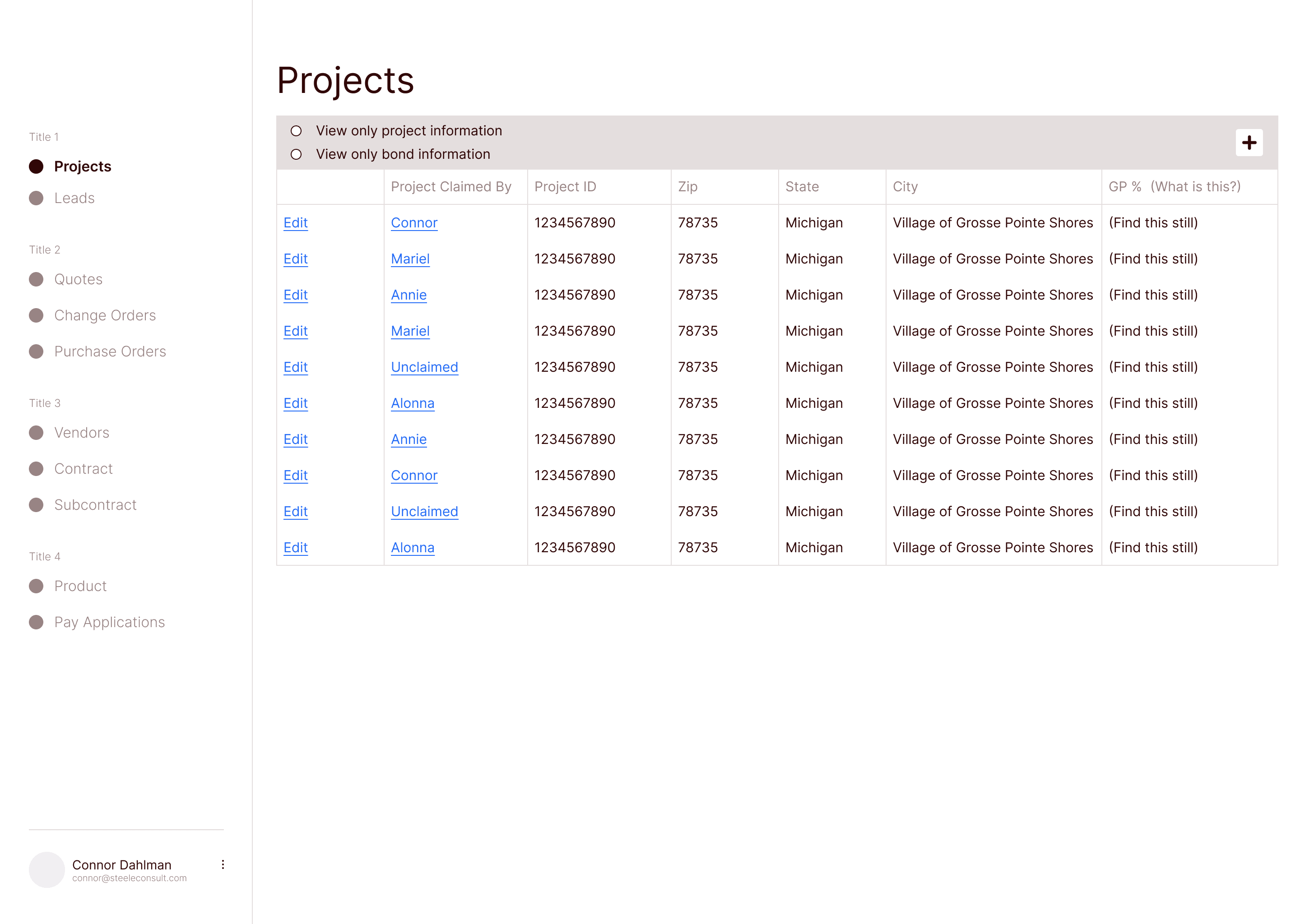
Simple table that shows ongoing projects
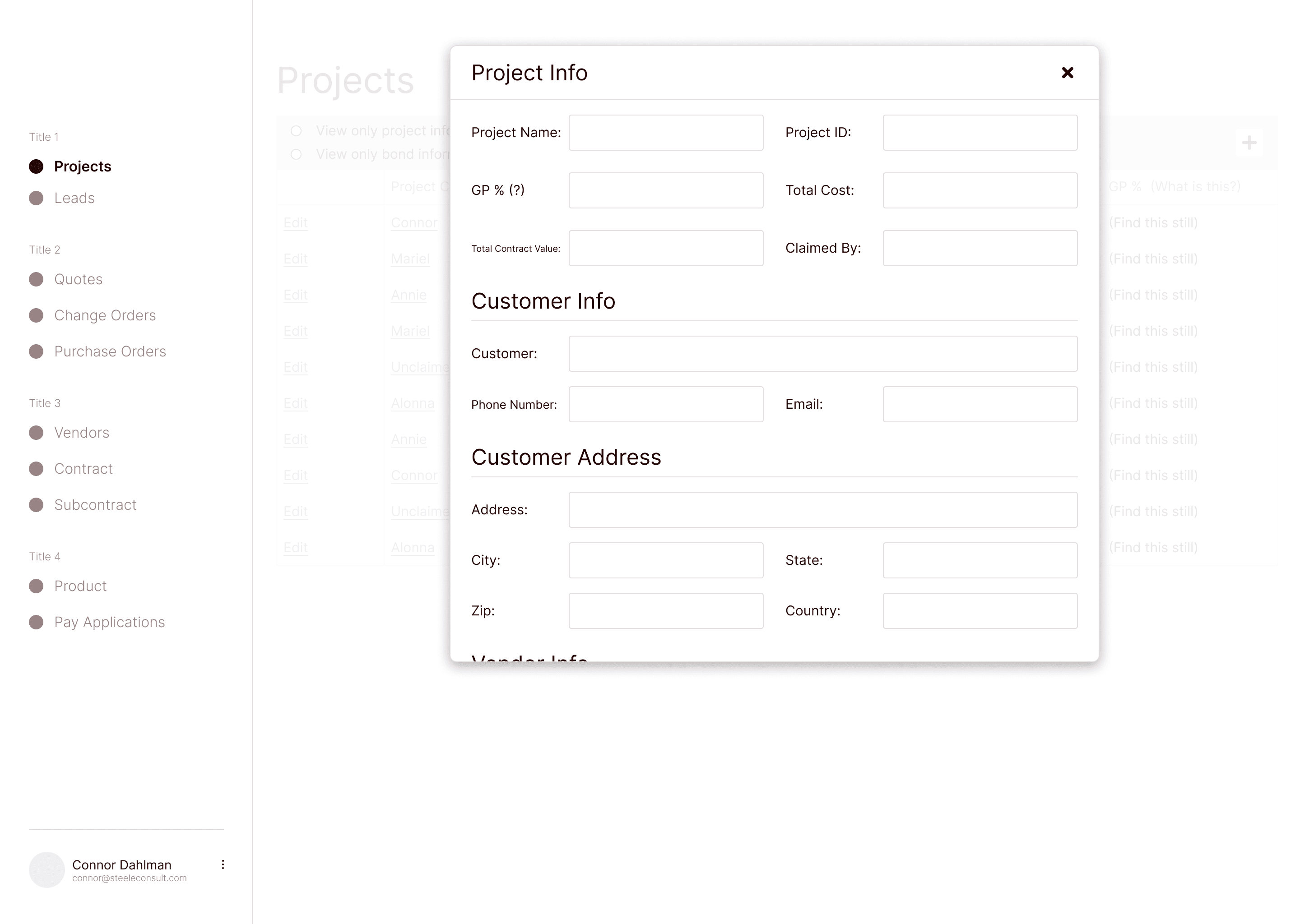
Adding a new project
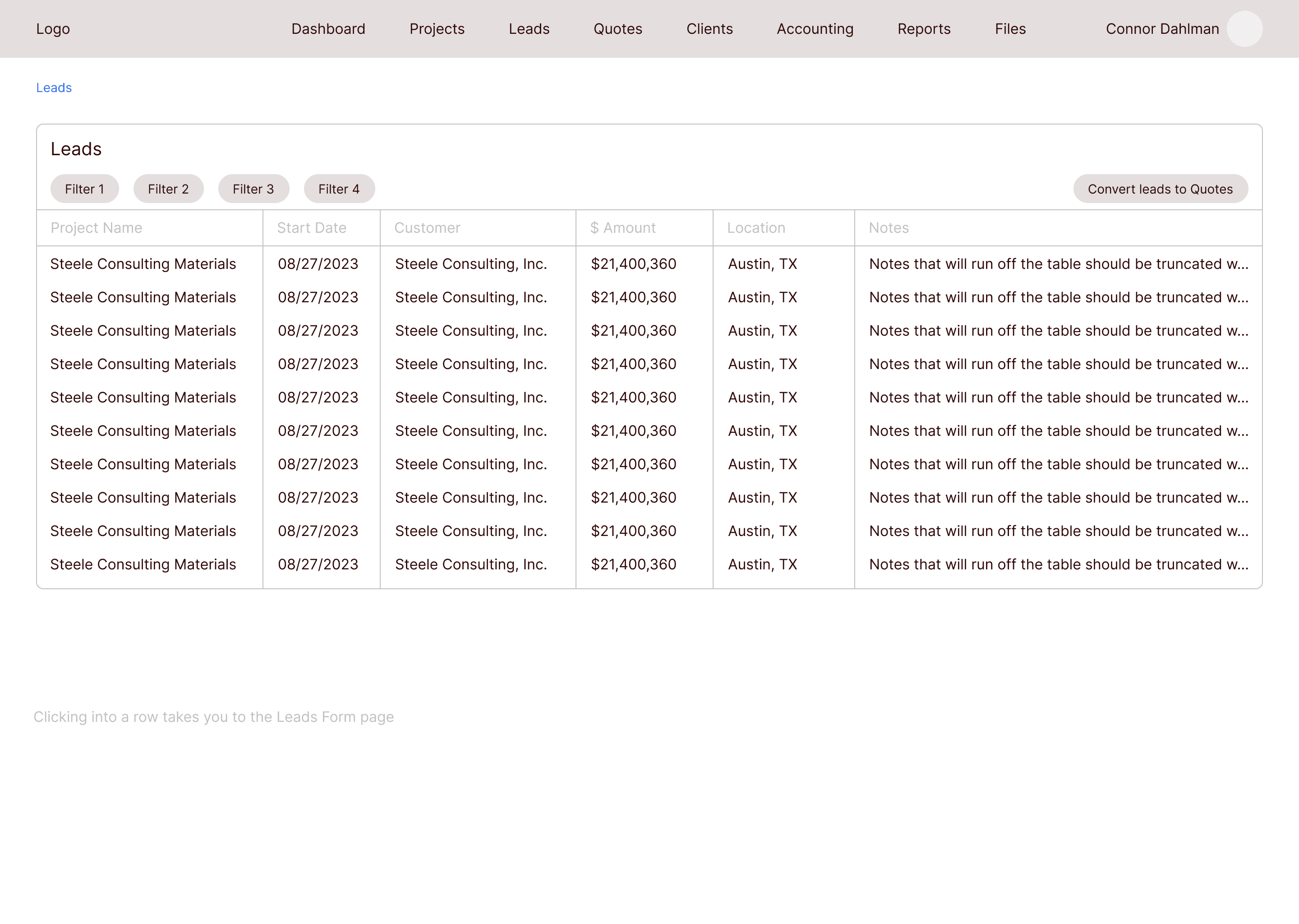
All Leads
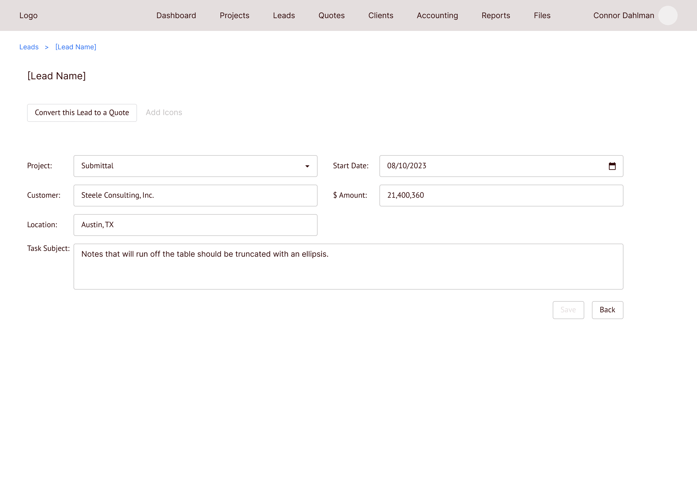
Clicking into a lead allows you to edit the information
All Quotes
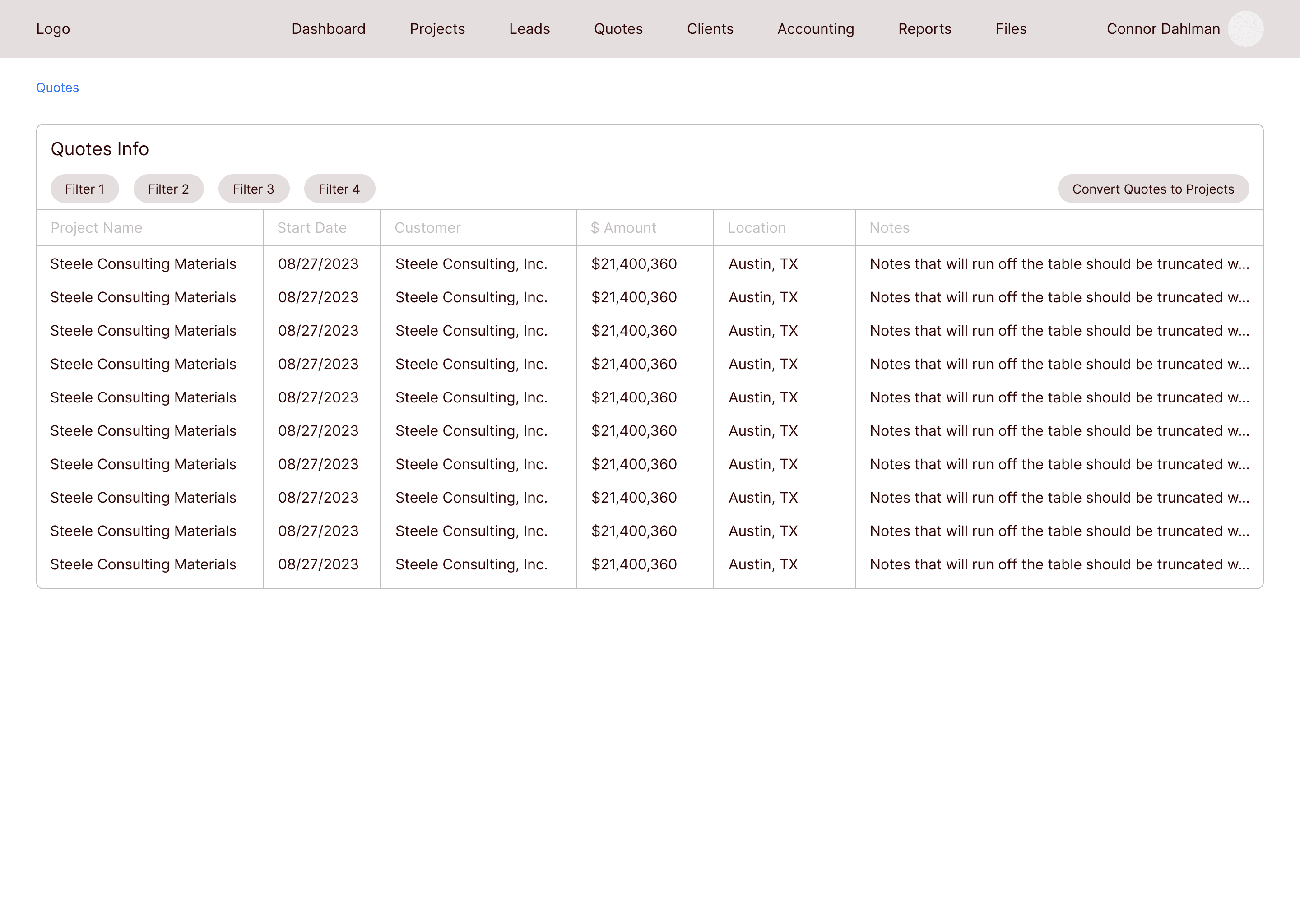
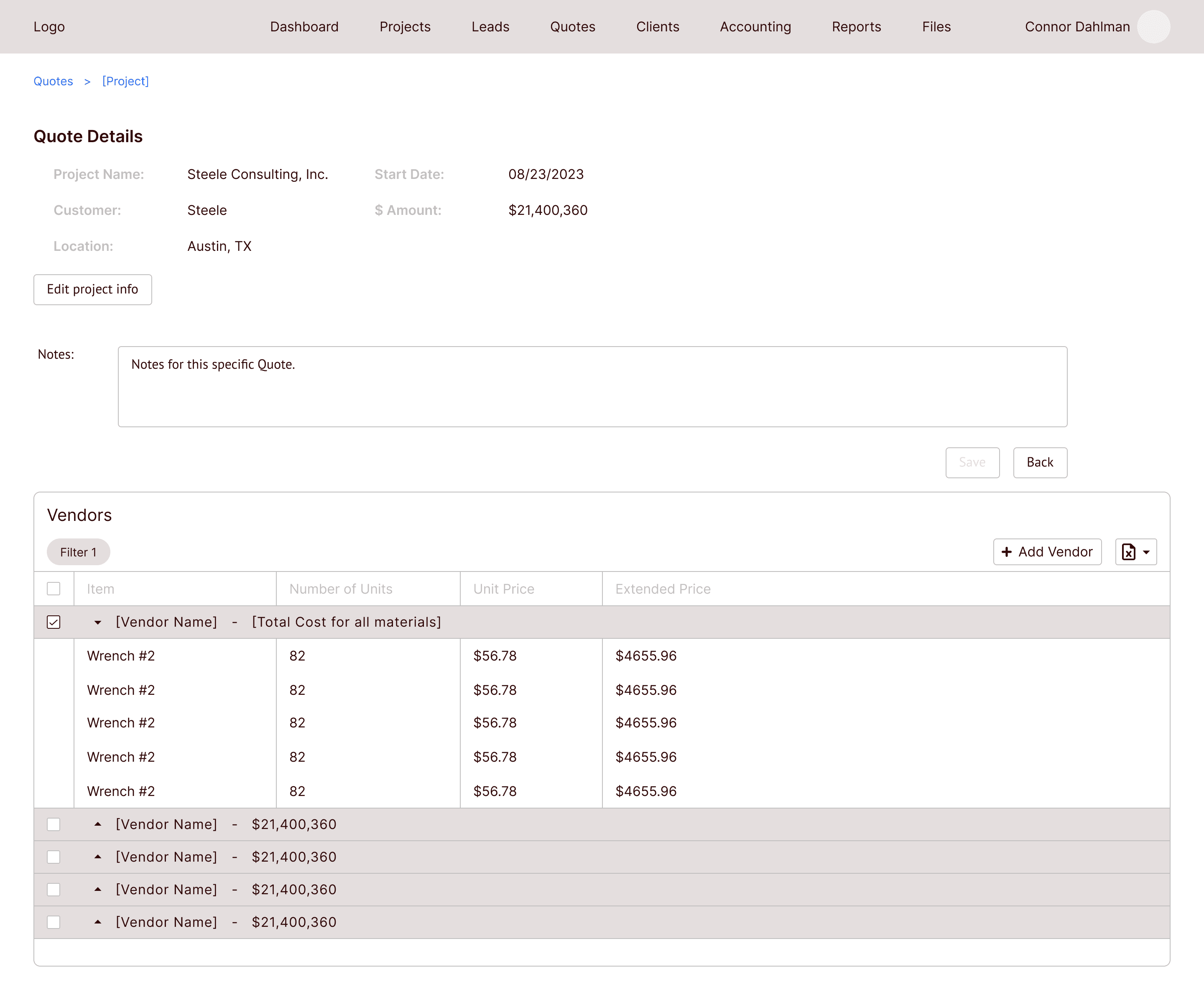
Vendor information is added on this page
Projects
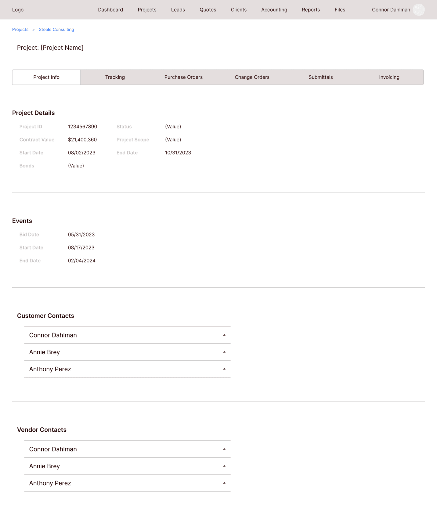
On the Projects page, lots of new information is added. There are different tabs at the top to toggle between project info, purchase orders, and invoices, among other items.
Navigating to each tab would allow the users to add the necessary data once they have it.
All Projects
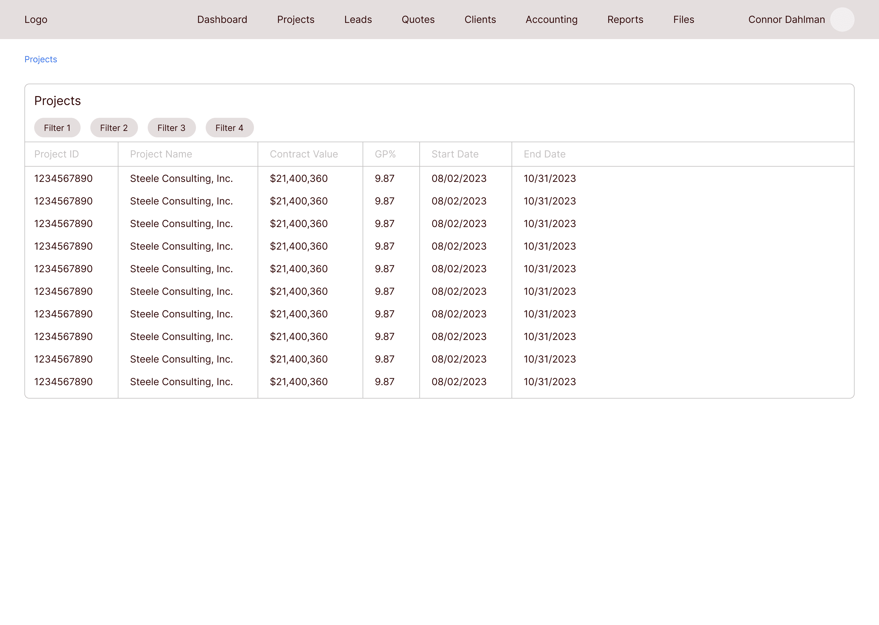
Project page with all extra information
The second stakeholder presentation
I presented this new design to the F&C team, and they were very happy with that I was able to pivot and change the whole design to include an actual flow.
I asked them to define more of the terms in the design so I could better understand the flow and process. They also pointed out a few areas where some information was missing, and they went through areas where they thought they would have difficulty navigating through the flow.
Old nav design
The items in the first top nav were out of order according to the PO.

New nav design
I rearranged the items in the nav and removed the unnecessary pages. This new order reflects the project flow much better.

Updating the Leads, Quotes, and Projects pages
Old Leads
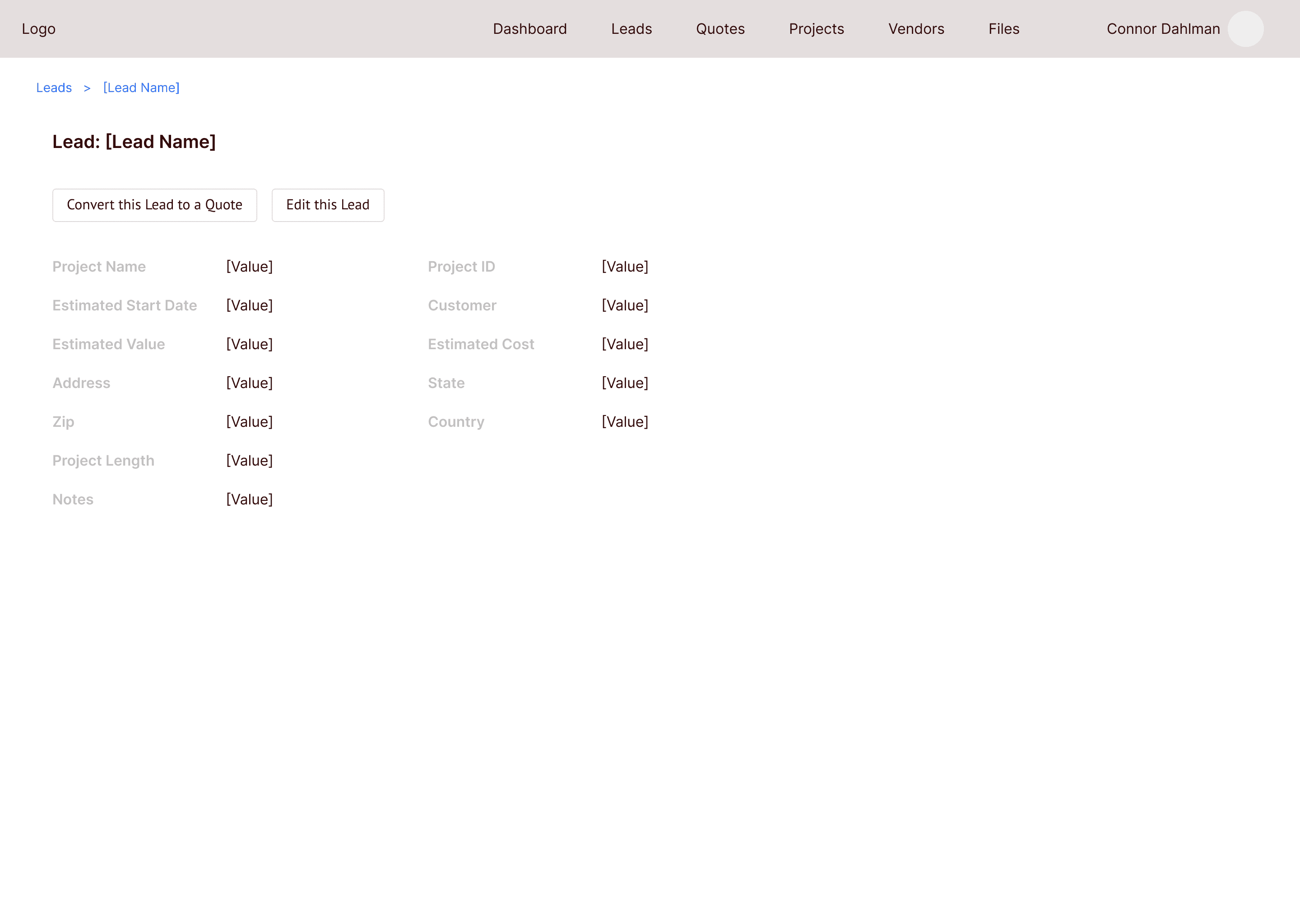
Clicking into a Lead on the old wireframes took you to a screen where you could edit the information. This could lead to mistakes in the data if you accidentally change the info without knowing.

New Leads
Now you are required to click a button to edit the Lead information. This will prevent changing the information by accident. The act of changing the info is much more intentional.
Updating the Projects page
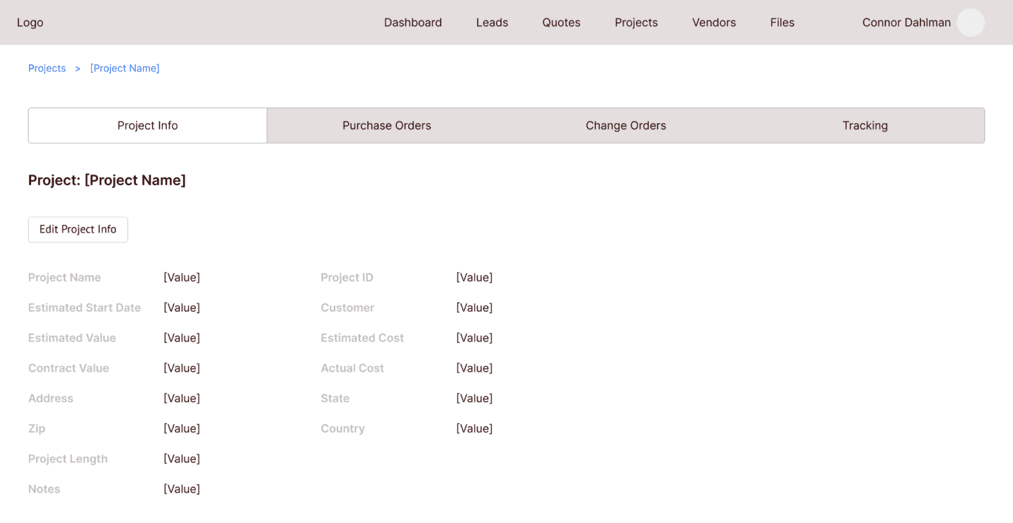
Reducing the tabs
I removed the unnecessary tabs and created new tables for each of the tabs.
The third stakeholder presentation
After cleaning up the wireframes again, I met with the PO and the F&C team to show them the changes. They were much happier with how everything worked this time around, and I got the green light to start working on the high fidelity designs.
Clickable prototype
Here is a clickable version of the high fidelity prototype I made for this project. Feel free to click through it for yourself.
For the best experience, click the full screen icon at the top right of the prototype to view it larger.
MY ROLE
Product Designer
THE TEAM
1 Product Designer
1 Product Owner
1 Project Manager
2 Developers
TOOLS USED(?)
Figma
Google Suite
I worked with the developers throughout this project so handoff was easy. They had already been working on the backend while I was working on the designs, but now they could start on the UI elements.
The hifi design I’m showing in this case study is for phase one of this project. While working with the F&C team, they had a lot of great ideas that were out of scope, like integrating Microsoft Teams chat into the dashboard, or creating task lists for each employee. Ideas like these were going to be pushed back to later phases.
Shortly after development on phase one began, I left Steele to work at Finality. This was a fun project to work on, and I would have enjoyed designing all of the ideas for the upcoming phases.
Helping a family business track projects more efficiently
2024

The folks at F&C Eaton needed help managing their projects
F&C Eaton was in need of a tool where they could track their projects, purchase orders, inventory, clients, and timelines. Before, they were filling out paper forms and using excel to track everything. They came to Steele so we could make a program that vastly increases employee efficiency when tracking and updating projects.
F&C Eaton’s work process was slow, and employees were spending too much time looking through, organizing, and updating project information in Excel.
I designed a B2B tool that will allow F&C employees to track and manage their projects, clients, and vendors
I designed a B2B tool that allows F&C Eaton employees to track the progress of their ongoing projects, organize their projects, track purchases and inventory, and manage client information.
Project page

THE DELIVERABLES
Grayscale Wireframes
Hifi Prototypes
Screen Mocks
THE COMPANIES
Steele Consulting Inc: My employer where I worked as Product Design consultant.
F&C Eaton: My client, a small, family owned business that provides construction materials, supplies, and equipment to their clients, which consist of medium to large construction businesses and government entities.
Wireframes 1, 2, & 3
By the time I joined the project, the developers had gathered basic information from the client, and I was told they wanted a way to store projects they’ve worked on in a sort of database. I later found out they needed to track their projects through the entire project lifecycle, but my first wireframe was based on the idea that they just wanted to store projects online.
I initially designed a basic grid-based UI that would allow them to add and edit projects at different states in the process. I presented this version of the designs to gather feedback and take suggestions for future iterations.
The first stakeholder presentation
After sharing the first iteration of wireframes with the F&C team, they thought a lot was missing. They were expecting to see more of a flow. They wanted to start each project as a Lead, then convert it to a Quote, and then convert it to a Project. They also needed to be able to add new data as the project progressed.
On the Steele side, I used this opportunity to clarify many of the terms used by the F&C team. They had their own way of describing their projects and process, and they wanted that terminology used in the design.
Now, with a better understanding of the lingo, I completely changed the design by creating a flow that allows projects to move from state to state, with info that can be updated as the project moves along.
Leads
F&C Eaton starts each of their projects as a Lead, which contains information about a potential client. When that client wants to move forward with F&C’s services, the Lead is converted to a Quote by clicking “Convert this Lead to a Quote”.
Quotes
In the Quote state, Vendor information is added, which includes each vendor that will be used for this project. Items that will be purchased from the vendors are added to the vendor table as well.
Once the project moves forward, the Quote would then be converted to a Project where more information is added.
Navigation changes
Check out the clickable prototype
Developer handoff and conclusion
Simple table that shows ongoing projects

Adding a new project


All Leads

Clicking into a lead allows you to edit the information
All Quotes


Vendor information is added on this page
Projects
On the Projects page, lots of new information is added. There are different tabs at the top to toggle between project info, purchase orders, and invoices, among other items.
Navigating to each tab would allow the users to add the necessary data once they have it.
All Projects

Project page with all extra information

The second stakeholder presentation
I presented this new design to the F&C team, and they were very happy with that I was able to pivot and change the whole design to include an actual flow.
I asked them to define more of the terms in the design so I could better understand the flow and process. They also pointed out a few areas where some information was missing, and they went through areas where they thought they would have difficulty navigating through the flow.
Old nav design
The items in the first top nav were out of order according to the PO.

New nav design
I rearranged the items in the nav and removed the unnecessary pages. This new order reflects the project flow much better.

Updating the Leads, Quotes, and Projects pages
Old Leads
Clicking into a Lead on the old wireframes took you to a screen where you could edit the information. This could lead to mistakes in the data if you accidentally change the info without knowing.

New Leads
Now you are required to click a button to edit the Lead information. This will prevent changing the information by accident. The act of changing the info is much more intentional.

Updating the Projects page
Reducing the tabs
I removed the unnecessary tabs and created new tables for each of the tabs.

The third stakeholder presentation
After cleaning up the wireframes again, I met with the PO and the F&C team to show them the changes. They were much happier with how everything worked this time around, and I got the green light to start working on the high fidelity designs.
Clickable prototype
Here is a clickable version of the high fidelity prototype I made for this project. Feel free to click through it for yourself.
For the best experience, click the full screen icon at the top right of the prototype to view it larger.
MY ROLE
Product Designer
THE TEAM
1 Product Designer
1 Product Owner
1 Project Manager
2 Developers
TOOLS USED(?)
Figma
Google Suite
I worked with the developers throughout this project so handoff was easy. They had already been working on the backend while I was working on the designs, but now they could start on the UI elements.
The hifi design I’m showing in this case study is for phase one of this project. While working with the F&C team, they had a lot of great ideas that were out of scope, like integrating Microsoft Teams chat into the dashboard, or creating task lists for each employee. Ideas like these were going to be pushed back to later phases.
Shortly after development on phase one began, I left Steele to work at Finality. This was a fun project to work on, and I would have enjoyed designing all of the ideas for the upcoming phases.
My other work
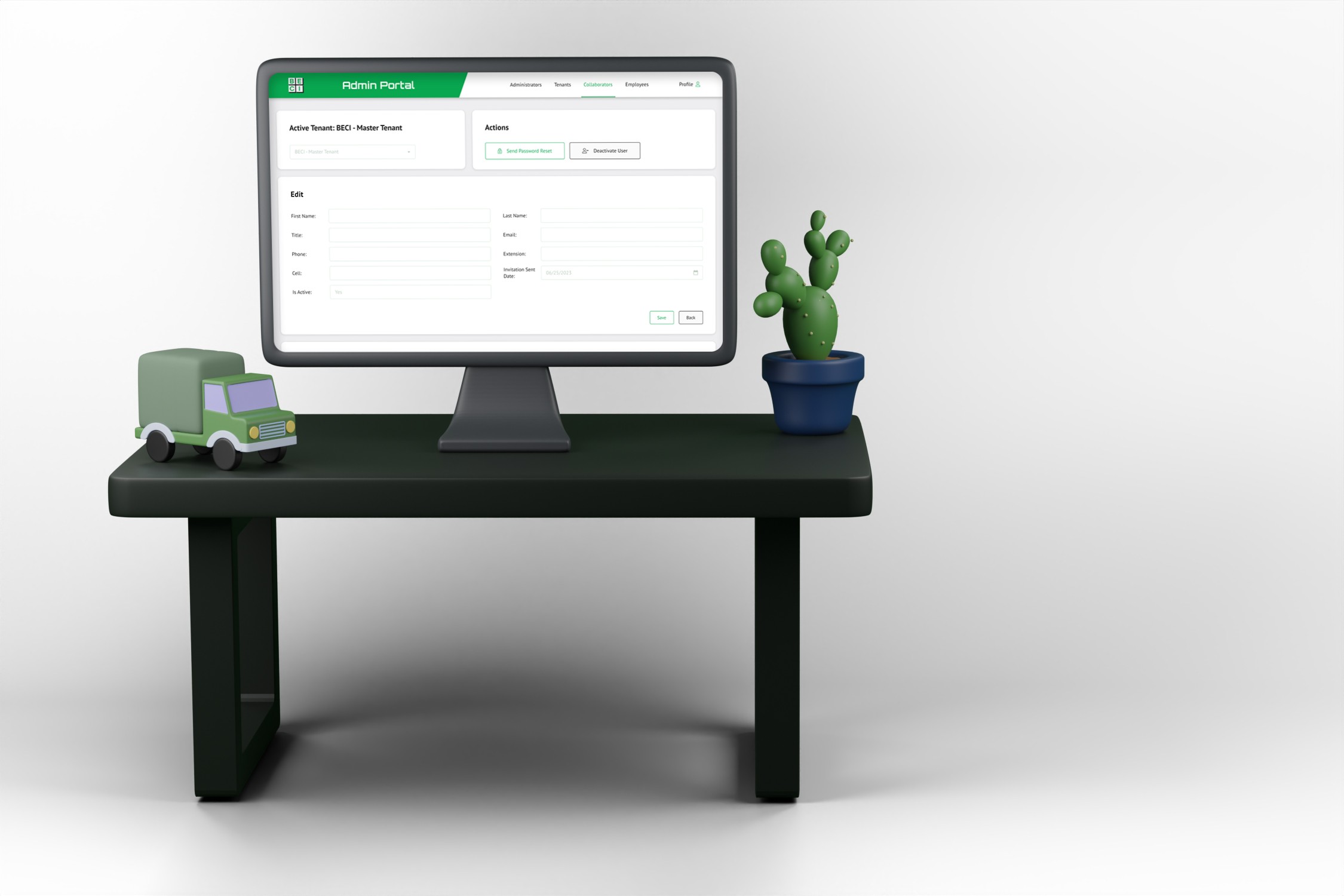
BECI
Want to say hi?
Send me an email or reach out on LinkedIn
colddahlman@gmail.com
© Connor Dahlman, 2024
Want to say hi?
Send me an email or reach out on LinkedIn
colddahlman@gmail.com
© Connor Dahlman, 2024
Helping a family business track projects more efficiently
2024

The folks at F&C Eaton needed help managing their projects
F&C Eaton was in need of a tool where they could track their projects, purchase orders, inventory, clients, and timelines. Before, they were filling out paper forms and using excel to track everything. They came to Steele so we could make a program that vastly increases employee efficiency when tracking and updating projects.
F&C Eaton’s work process was slow, and employees were spending too much time looking through, organizing, and updating project information in Excel.
I designed a B2B tool that will allow F&C employees to track and manage their projects, clients, and vendors
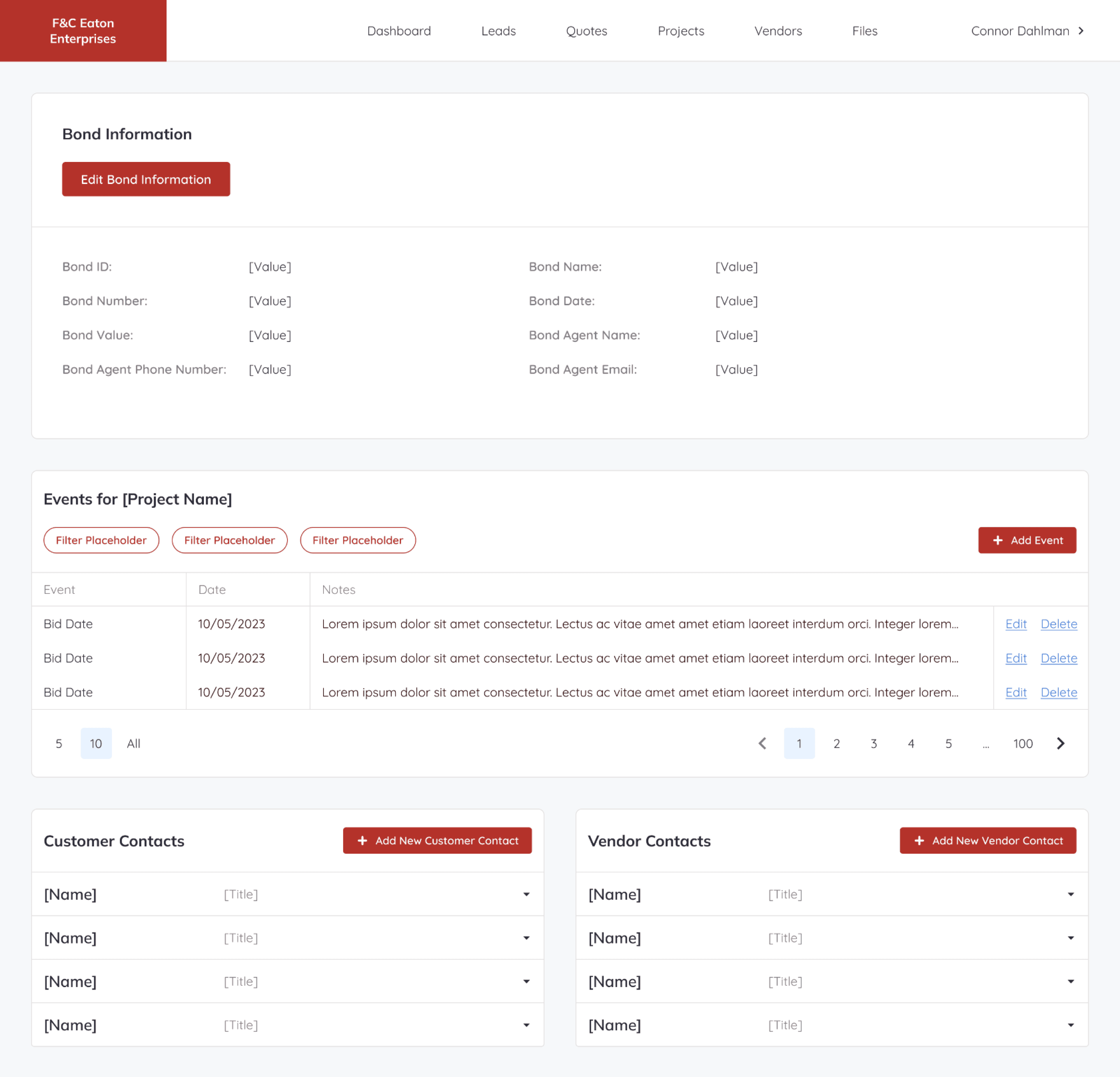
I designed a B2B tool that allows F&C Eaton employees to track the progress of their ongoing projects, organize their projects, track purchases and inventory, and manage client information.
Project page
MY ROLE
Product Designer
THE TEAM
1 Product Designer
1 Product Owner
1 Project Manager
2 Developers
THE DELIVERABLES
Grayscale Wireframes
Hifi Prototypes
Screen Mocks
TOOLS USED
Figma
Google Suite
THE COMPANIES
Steele Consulting Inc: My employer where I worked as Product Design consultant.
F&C Eaton: My client, a small, family owned business that provides construction materials, supplies, and equipment to their clients, which consist of medium to large construction businesses and government entities.
Wireframes 1, 2, & 3
By the time I joined the project, the developers had gathered basic information from the client, and I was told they wanted a way to store projects they’ve worked on in a sort of database. I later found out they needed to track their projects through the entire project lifecycle, but my first wireframe was based on the idea that they just wanted to store projects online.
I initially designed a basic grid-based UI that would allow them to add and edit projects at different states in the process. I presented this version of the designs to gather feedback and take suggestions for future iterations.
Simple table that shows ongoing projects

Adding a new project

The first stakeholder presentation
After sharing the first iteration of wireframes with the F&C team, they thought a lot was missing. They were expecting to see more of a flow. They wanted to start each project as a Lead, then convert it to a Quote, and then convert it to a Project. They also needed to be able to add new data as the project progressed.
On the Steele side, I used this opportunity to clarify many of the terms used by the F&C team. They had their own way of describing their projects and process, and they wanted that terminology used in the design.
Now, with a better understanding of the lingo, I completely changed the design by creating a flow that allows projects to move from state to state, with info that can be updated as the project moves along.
Leads
F&C Eaton starts each of their projects as a Lead, which contains information about a potential client. When that client wants to move forward with F&C’s services, the Lead is converted to a Quote by clicking “Convert this Lead to a Quote”.
All Leads

Clicking into a lead allows you to edit the information

Quotes
In the Quote state, Vendor information is added, which includes each vendor that will be used for this project. Items that will be purchased from the vendors are added to the vendor table as well.
Once the project moves forward, the Quote would then be converted to a Project where more information is added.
All Quotes

Vendor information is added on this page

Projects
On the Projects page, lots of new information is added. There are different tabs at the top to toggle between project info, purchase orders, and invoices, among other items.
Navigating to each tab would allow the users to add the necessary data once they have it.
All Projects

Project page with all extra information

The second stakeholder presentation
I presented this new design to the F&C team, and they were very happy with that I was able to pivot and change the whole design to include an actual flow.
I asked them to define more of the terms in the design so I could better understand the flow and process. They also pointed out a few areas where some information was missing, and they went through areas where they thought they would have difficulty navigating through the flow.
Navigation changes
Old nav design
The items in the first top nav were out of order according to the PO.

New nav design
I rearranged the items in the nav and removed the unnecessary pages. This new order reflects the project flow much better.

Updating the Leads, Quotes, and Projects pages
Old Leads
Clicking into a Lead on the old wireframes took you to a screen where you could edit the information. This could lead to mistakes in the data if you accidentally change the info without knowing.

New Leads
Now you are required to click a button to edit the Lead information. This will prevent changing the information by accident. The act of changing the info is much more intentional.

Updating the Projects page
Reducing the tabs
I removed the unnecessary tabs and created new tables for each of the tabs.

The third stakeholder presentation
After cleaning up the wireframes again, I met with the PO and the F&C team to show them the changes. They were much happier with how everything worked this time around, and I got the green light to start working on the high fidelity designs.
Check out the clickable prototype
Clickable prototype
Here is a clickable version of the high fidelity prototype I made for this project. Feel free to click through it for yourself.
For the best experience, click the full screen icon at the top right of the prototype to view it larger.
Developer handoff and conclusion
I worked with the developers throughout this project so handoff was easy. They had already been working on the backend while I was working on the designs, but now they could start on the UI elements.
The hifi design I’m showing in this case study is for phase one of this project. While working with the F&C team, they had a lot of great ideas that were out of scope, like integrating Microsoft Teams chat into the dashboard, or creating task lists for each employee. Ideas like these were going to be pushed back to later phases.
Shortly after development on phase one began, I left Steele to work at Finality. This was a fun project to work on, and I would have enjoyed designing all of the ideas for the upcoming phases.
My other work

BECI


Want to say hi?
Send me an email or reach out on LinkedIn
colddahlman@gmail.com
© Connor Dahlman, 2024
