Modernizing an outdated blog website
2023
The old website was extremely outdated
The design of the previous Preflight blog pages had not been updated in about a decade, plus the style of the old pages didn’t match the updated Preflight branding.
Also, the old blogs pages were not responsive. This simply will not do.
So I redesigned the website
I worked with one other designer to create the designes for this project. I designed the homepage, and she designed the blog / reading page. We collaborated and used the same components if they repeated on both pages, and we both followed the recently updated Preflight style guide to ensure the style would be consistent across the website as a whole.
Here’s a comparison of the old homepage versus my updated design.
Old Preflight blog homepage


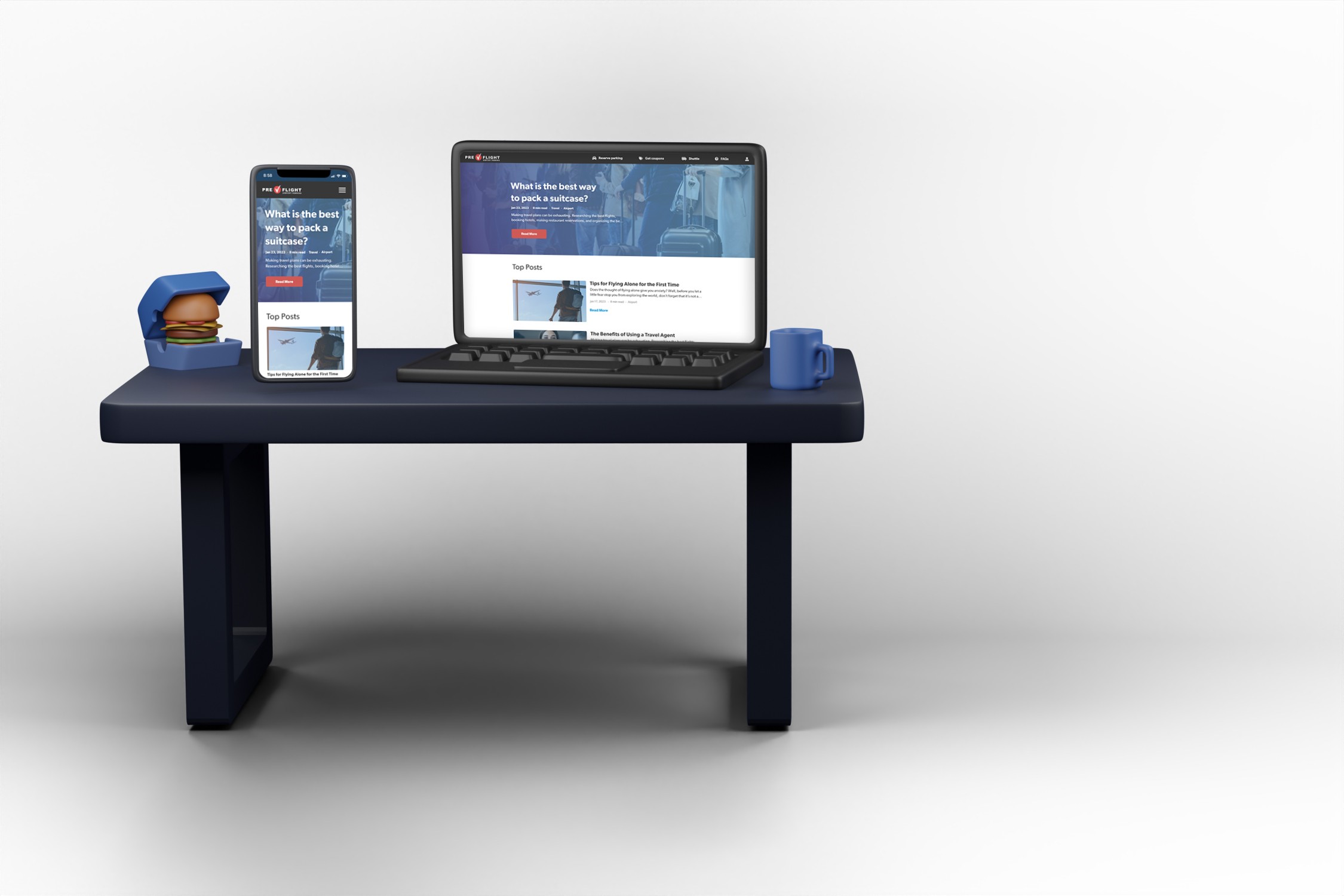
New Preflight blog homepage

MY ROLE
Product Designer
THE TEAM
2 Product Designers
1 Product Owner
1 Project Manager
2 Developers
THE DELIVERABLES
Comparative Research Deliverables
Grayscale Wireframes
Hifi Prototypes
Screen Mocks
TOOLS USED
Adobe XD
Google Suite
THE COMPANIES
Steele Consulting Inc: My employer where I worked as Product Design consultant.
Preflight: A subsidiary of Interpark. Preflight owns and operates 5 airport parking locations in the U.S.
Looking at other blog websites
I looked at other blog homepages to see how they did things. Other blogs used images that went along with the titles of the blogs, they weren’t just a list of links like the Preflight blogs page.
Most other blogs utilized large thumbnail pictures to go along with the title of the blog. Other blog homepages usually separated the content in some way, either by sorting by category, popularity, or recent posts. I also liked the homepages that had a large banner style ad as the hero image.
Here are a few of the blog pages I looked at during this project.
Mashable
Separating blogs by category.

Helpscout
Thumbnails with the blog titles.

Brit
Hero image showcasing a blog.

I presented these findings to the PO along with screenshots from the blogs I researched. He liked the idea of adding images to the blog titles, creating separation on the page, and using a blog post as a hero image. He gave me the green light to start working on the wireframes.
I then talked to the developers to see if there were any restrictions. The new Preflight website was built using the Angular framework, so my designs had to match that style.
Creating grayscale wireframes
I went through about four rounds of wireframing, and I held a feedback session for each round with Steele’s design team, the PO, the engineering team, and a few extra stakeholders from Interpark.
I’ve posted some of the highlights here.
Highlight one: the start
For the first round of wireframes, I created different layouts of grids of blog thumbnails and titles mimicking other popular blog websites.
Option 1
A basic grid of posts.

Option 2
Posts filtered by category.

Option 3
Top posts separated from other posts.

Highlight two: layout
Option three was the group’s choice, so I decided to change the layout in the top post / latest post to see which would be more popular with the stakeholders.
I also added a search bar and filters to one of the wireframes, and I created a mock for the mobile view as well.


Highlight three: filtering
Preflight’s PO really liked new and unique ideas, so I spent some time coming up with different ways to filter through the tags. Here you can see a few of my ideas.
Exploring dropdowns
Dropdowns are a popular way to apply filters, so I gave it a shot.


Looking at buttons
Filtering with the click of a button is simple, easy, and clean.


How many clicks?
We discussed whether the filters should apply instantly, or if the user would need to preform an action to apply the filters. I suggested live updating, so there would be one less action for the user to take, and we also assumed that users would only choose one filter at a time.
I think the user should have to apply the filters if they choose more than one, but that wouldn’t happen often according to the PO.


The Winner
Live update tag buttons next to the latest post column, my first proposal. Simple, easy, and quick, clicking on a tag instantly shows all posts that have that tag, and all other posts disappear. Plus, the top post will always be at the top of the page. Those are the ones hand picked by the PO to be the first thing people see when they visit the website.
Each filter is a button that automatically updates the page with your selection when it is pressed.

Following the new style guide
I utilized the updated Preflight Style Guide to redesign the Preflight blog pages. I did some competitive research to see how other blog pages are laid out and styled, and I applied those learnings to the Preflight blogs.
Here are some slides from the updated Preflight style guide I followed.


Multiple hifi iterations
First hifi iteration
After getting approval on the final wireframes, I started working on the high fidelity designs.
The PO wanted to see what different locations for the search bar looked like in high fidelity, so I made a few options to show him.


Second hifi iteration
In the second hifi iteration, I moved the search bar to right above the tags so it would be less intrusive. I also added the tags, description, and CTA to the header/ hero image to give users a more clear target, and I created a mobile view as well.


Third and final hifi iteration
The PO liked the new location for the search bar, and he wanted the gradient on the hero image to be less colorful. I changed the opacity and direction of the gradient, and he approved it. I also added the latest Preflight UI elements to the design, like the top nav and footer, and it was complete.


Developer handoff and conclusion
I handed over the designs to the development team so they could build the pages. The engineers built the website, but there are some inconsistencies with the design. The client did not allow me to conduct design QA (this was always a battle), so the way the pages are now is how they will stay until they are redesigned again.
Here’s the link to the Preflight blogs page so you can check it out yourself.

Work
About
My other work
BECI
My other work
BECI
BECI
Want to say hi?
Send me an email or reach out on LinkedIn
colddahlman@gmail.com
© Connor Dahlman, 2024
Want to say hi?
Send me an email or reach out on LinkedIn
colddahlman@gmail.com
© Connor Dahlman, 2024
Modernizing an outdated blog website
2023
The old website was extremely outdated
The design of the previous Preflight blog pages had not been updated in about a decade, plus the style of the old pages didn’t match the updated Preflight branding.
Also, the old blogs pages were not responsive. This simply will not do.
So I redesigned the website
I worked with one other designer to create the designes for this project. I designed the homepage, and she designed the blog / reading page. We collaborated and used the same components if they repeated on both pages, and we both followed the recently updated Preflight style guide to ensure the style would be consistent across the website as a whole.
Here’s a comparison of the old homepage versus my updated design.
Old Preflight blog homepage


New Preflight blog homepage

MY ROLE
Product Designer
THE TEAM
2 Product Designers
1 Product Owner
1 Project Manager
2 Developers
THE DELIVERABLES
Comparative Research Deliverables
Grayscale Wireframes
Hifi Prototypes
Screen Mocks
TOOLS USED
Adobe XD
Google Suite
THE COMPANIES
Steele Consulting Inc: My employer where I worked as Product Design consultant.
Preflight: A subsidiary of Interpark. Preflight owns and operates 5 airport parking locations in the U.S.
Creating grayscale wireframes
I went through about four rounds of wireframing, and I held a feedback session for each round with Steele’s design team, the PO, the engineering team, and a few extra stakeholders from Interpark.
I’ve posted some of the highlights here.
Highlight one: the start
For the first round of wireframes, I created different layouts of grids of blog thumbnails and titles mimicking other popular blog websites.
Option 1
A basic grid of posts.
Option 2
Posts filtered by category.
Option 3
Top posts separated from other posts.
Highlight two: layout
Option three was the group’s choice, so I decided to change the layout in the top post / latest post to see which would be more popular with the stakeholders.
I also added a search bar and filters to one of the wireframes, and I created a mock for the mobile view as well.


Highlight three: filtering
Preflight’s PO really liked new and unique ideas, so I spent some time coming up with different ways to filter through the tags. Here you can see a few of my ideas.
Exploring dropdowns
Dropdowns are a popular way to apply filters, so I gave it a shot.


Looking at buttons
Filtering with the click of a button is simple, easy, and clean.


How many clicks?
We discussed whether the filters should apply instantly, or if the user would need to preform an action to apply the filters. I suggested live updating, so there would be one less action for the user to take, and we also assumed that users would only choose one filter at a time.
I think the user should have to apply the filters if they choose more than one, but that wouldn’t happen often according to the PO.


The Winner
Live update tag buttons next to the latest post column, my first proposal. Simple, easy, and quick, clicking on a tag instantly shows all posts that have that tag, and all other posts disappear. Plus, the top post will always be at the top of the page. Those are the ones hand picked by the PO to be the first thing people see when they visit the website.
Each filter is a button that automatically updates the page with your selection when it is pressed.

Following the new style guide
I utilized the updated Preflight Style Guide to redesign the Preflight blog pages. I did some competitive research to see how other blog pages are laid out and styled, and I applied those learnings to the Preflight blogs.
Here are some slides from the updated Preflight style guide I followed.
Multiple hifi iterations
First hifi iteration
After getting approval on the final wireframes, I started working on the high fidelity designs.
The PO wanted to see what different locations for the search bar looked like in high fidelity, so I made a few options to show him.


Second hifi iteration
In the second hifi iteration, I moved the search bar to right above the tags so it would be less intrusive. I also added the tags, description, and CTA to the header/ hero image to give users a more clear target, and I created a mobile view as well.

Third and final hifi iteration
The PO liked the new location for the search bar, and he wanted the gradient on the hero image to be less colorful. I changed the opacity and direction of the gradient, and he approved it. I also added the latest Preflight UI elements to the design, like the top nav and footer, and it was complete.


Developer handoff and conclusion
I handed over the designs to the development team so they could build the pages. The engineers built the website, but there are some inconsistencies with the design. The client did not allow me to conduct design QA (this was always a battle), so the way the pages are now is how they will stay until they are redesigned again.
Here’s the link to the Preflight blogs page so you can check it out yourself.

Looking at other blog websites
I looked at other blog homepages to see how they did things. Other blogs used images that went along with the titles of the blogs, they weren’t just a list of links like the Preflight blogs page.
Most other blogs utilized large thumbnail pictures to go along with the title of the blog. Other blog homepages usually separated the content in some way, either by sorting by category, popularity, or recent posts. I also liked the homepages that had a large banner style ad as the hero image.
Here are a few of the blog pages I looked at during this project.
Mashable
Separating blogs by category.
Helpscout
Thumbnails with the blog titles.
Brit
Hero image showcasing a blog.
I presented these findings to the PO along with screenshots from the blogs I researched. He liked the idea of adding images to the blog titles, creating separation on the page, and using a blog post as a hero image. He gave me the green light to start working on the wireframes.
I then talked to the developers to see if there were any restrictions. The new Preflight website was built using the Angular framework, so my designs had to match that style.
Modernizing an outdated blog website
2023
The old website was extremely outdated
The design of the previous Preflight blog pages had not been updated in about a decade, plus the style of the old pages didn’t match the updated Preflight branding.
Also, the old blogs pages were not responsive. This simply will not do.
So I redesigned the website
I worked with one other designer to create the designes for this project. I designed the homepage, and she designed the blog / reading page. We collaborated and used the same components if they repeated on both pages, and we both followed the recently updated Preflight style guide to ensure the style would be consistent across the website as a whole.
Here’s a comparison of the old homepage versus my updated design.
Old Preflight blog homepage
New Preflight blog homepage
MY ROLE
Product Designer
THE TEAM
2 Product Designers
1 Product Owner
1 Project Manager
2 Developers
THE DELIVERABLES
Comparative Research Deliverables
Grayscale Wireframes
Hifi Prototypes
Screen Mocks
TOOLS USED
Adobe XD
Google Suite
THE COMPANIES
Steele Consulting Inc: My employer where I worked as Product Design consultant.
Preflight: A subsidiary of Interpark. Preflight owns and operates 5 airport parking locations in the U.S.
Creating grayscale wireframes
I went through about four rounds of wireframing, and I held a feedback session for each round with Steele’s design team, the PO, the engineering team, and a few extra stakeholders from Interpark.
I’ve posted some of the highlights here.
Highlight one: the start
For the first round of wireframes, I created different layouts of grids of blog thumbnails and titles mimicking other popular blog websites.
Option 1
A basic grid of posts.
Option 2
Posts filtered by category.
Option 3
Top posts separated from other posts.
Highlight two: layout
Option three was the group’s choice, so I decided to change the layout in the top post / latest post to see which would be more popular with the stakeholders.
I also added a search bar and filters to one of the wireframes, and I created a mock for the mobile view as well.
Highlight three: filtering
Preflight’s PO really liked new and unique ideas, so I spent some time coming up with different ways to filter through the tags. Here you can see a few of my ideas.
Exploring dropdowns
Dropdowns are a popular way to apply filters, so I gave it a shot.
Looking at buttons
Filtering with the click of a button is simple, easy, and clean.
How many clicks?
We discussed whether the filters should apply instantly, or if the user would need to preform an action to apply the filters. I suggested live updating, so there would be one less action for the user to take, and we also assumed that users would only choose one filter at a time.
I think the user should have to apply the filters if they choose more than one, but that wouldn’t happen often according to the PO.
The Winner
Live update tag buttons next to the latest post column, my first proposal. Simple, easy, and quick, clicking on a tag instantly shows all posts that have that tag, and all other posts disappear. Plus, the top post will always be at the top of the page. Those are the ones hand picked by the PO to be the first thing people see when they visit the website.
Each filter is a button that automatically updates the page with your selection when it is pressed.
Following the new style guide
I utilized the updated Preflight Style Guide to redesign the Preflight blog pages. I did some competitive research to see how other blog pages are laid out and styled, and I applied those learnings to the Preflight blogs.
Here are some slides from the updated Preflight style guide I followed.
Multiple hifi iterations
First hifi iteration
After getting approval on the final wireframes, I started working on the high fidelity designs.
The PO wanted to see what different locations for the search bar looked like in high fidelity, so I made a few options to show him.
Second hifi iteration
In the second hifi iteration, I moved the search bar to right above the tags so it would be less intrusive. I also added the tags, description, and CTA to the header/ hero image to give users a more clear target, and I created a mobile view as well.
Third and final hifi iteration
The PO liked the new location for the search bar, and he wanted the gradient on the hero image to be less colorful. I changed the opacity and direction of the gradient, and he approved it. I also added the latest Preflight UI elements to the design, like the top nav and footer, and it was complete.
Developer handoff and conclusion
I handed over the designs to the development team so they could build the pages. The engineers built the website, but there are some inconsistencies with the design. The client did not allow me to conduct design QA (this was always a battle), so the way the pages are now is how they will stay until they are redesigned again.
Here’s the link to the Preflight blogs page so you can check it out yourself.
Looking at other blog websites
I looked at other blog homepages to see how they did things. Other blogs used images that went along with the titles of the blogs, they weren’t just a list of links like the Preflight blogs page.
Most other blogs utilized large thumbnail pictures to go along with the title of the blog. Other blog homepages usually separated the content in some way, either by sorting by category, popularity, or recent posts. I also liked the homepages that had a large banner style ad as the hero image.
Here are a few of the blog pages I looked at during this project.
Mashable
Separating blogs by category.
Helpscout
Thumbnails with the blog titles.
Brit
Hero image showcasing a blog.
I presented these findings to the PO along with screenshots from the blogs I researched. He liked the idea of adding images to the blog titles, creating separation on the page, and using a blog post as a hero image. He gave me the green light to start working on the wireframes.
I then talked to the developers to see if there were any restrictions. The new Preflight website was built using the Angular framework, so my designs had to match that style.