Saving the USCIS over $400,000 per year by fixing a broken user flow
TLDR
I reduced the table editing flow for all tables across the ROSS application from a 4 screen process to a single modal, saving USCIS employees hundreds of combined work hours per month, and the USCIS saves hundreds of thousands of dollars per year.
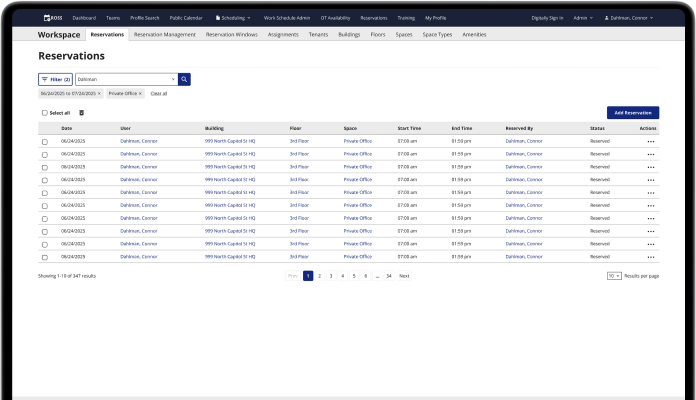
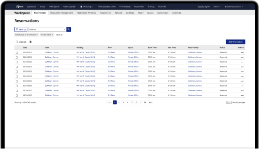
Old, broken flow
Multi-screen flow to get to the edit page for each row in the table.
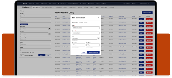
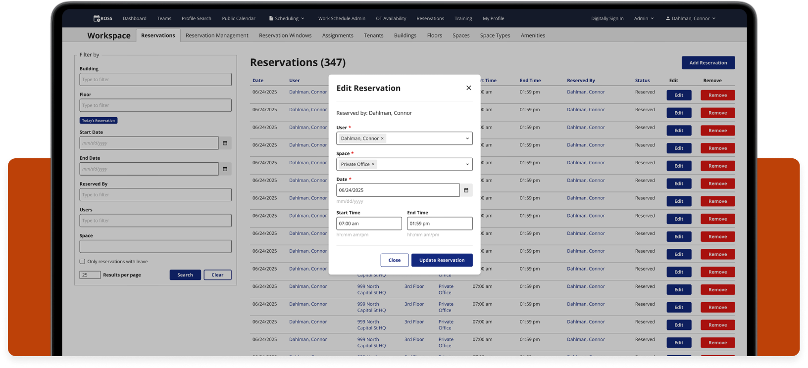
Updated flow
A single click opens the modal over the table for quick, easy editing.
The user, time, & money
ROSS has just over 4,000 daily users. These users are federal employees that include interviewing officers, schedulers, floor managers, and administrators.
In order for ROSS users to edit any table information within the app, they needed to go through a 4 screen process for each edit. Multiply the time it takes to get to the edit screen by the 4,000 ROSS users, and again by many multiple edits per day. It adds up to hundreds of wasted hours every month.
The time
x
4,000 daily ROSS users
x
10 edits per day on average
x
5 seconds of wasted time per edit
x
200,000 wasted seconds per day
200,000 seconds is equal to 55 hours, the number of hours USCIS officers waste on this bad flow every day.
The daily cost
x
55 wasted hours per day
x
$31.25 average hourly rate for USCIS Officer’s salary
x
$1,718.75 spent daily on a bad user flow
Based on the average USCIS officer’s salary of $65,000 per year, $1,718.75 is wasted every single day.
The yearly cost
x
$1,718.75 bad user flow daily cost
x
249 working days per year
x
$427,968 saved per year
$1,718.75 per day is $4,326,375 per year, counting all working days.
This is a very conservative estimate that only includes the time saved by navigating to the edit screen. After usability testing, users were able to fill out the form in the modal much faster as well.
I used an app called Matomo to track the time users were spending on various tasks while they used ROSS. Matomo allowed me to see the time it took for users to go from one page to another, and the time it took for users to fill out forms.
Improved usability
This above estimate is only the monetary gain. Users were much happier with the streamlined flow, stating that the multi-screen edit process was incredibly annoying. It forced them to look around for the proper buttons to click, and they had to think about what they were doing.
They also had to go through multiple loading screens to get to the edit page, which takes time and is annoying.
Now they are able to add new reservations or edit existing ones without breaking their concentration to think about how to navigate through a poor UI.
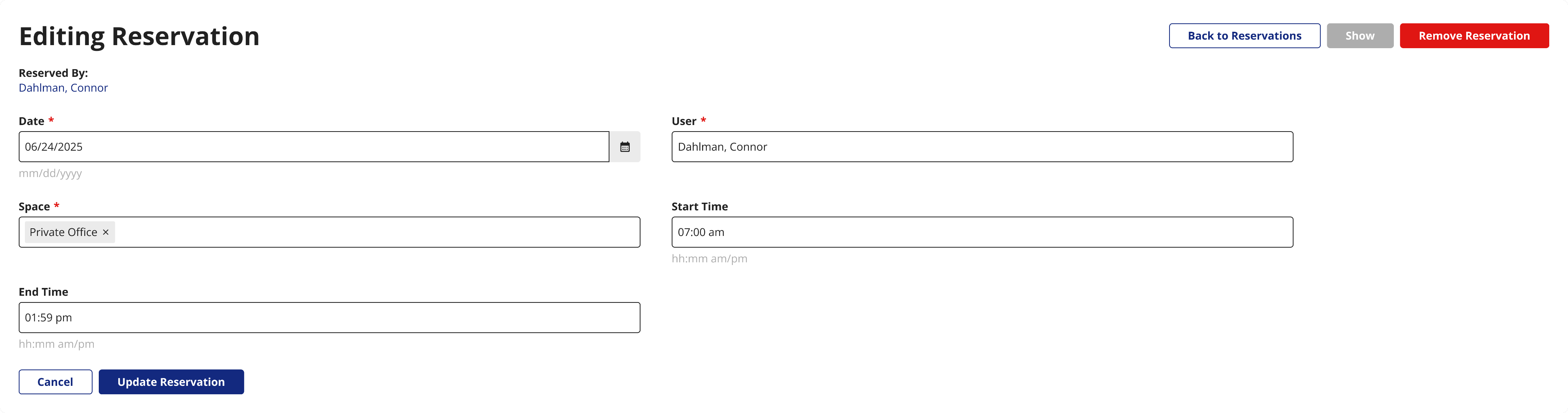
New vertical form design pattern
I designed this modal with a vertical layout for the form inputs, which is a design pattern I am implementing wherever I can across ROSS. Vertical forms match how people read and scan pages, from top to bottom and left to right. Users naturally scroll vertically, so vertical forms suit natural human behavior.
Old edit form
New edit form
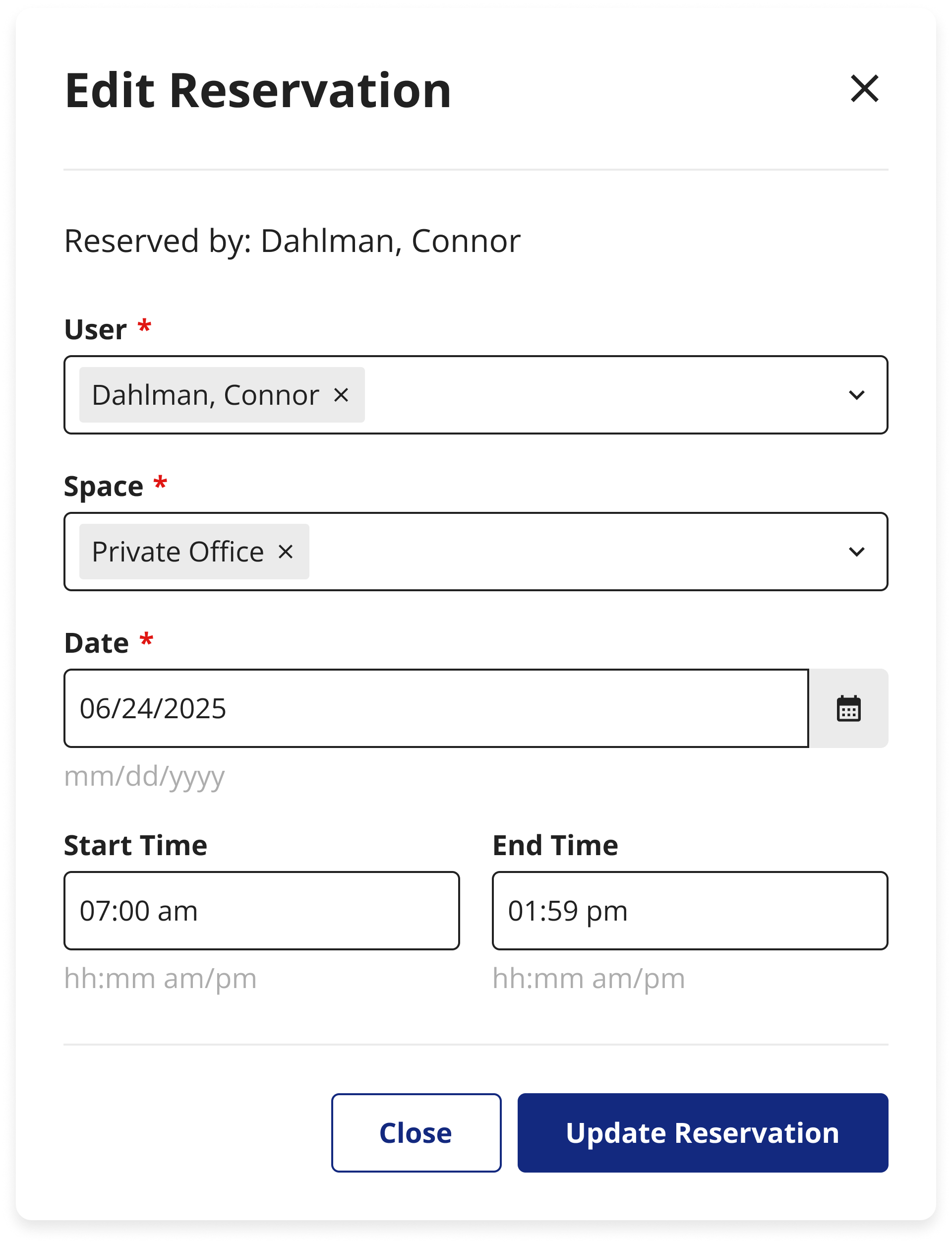
Vertical forms have shorter fields which improve readability. Short lines are more easily scanned than long lines of text or inputs. Vertical layouts also help structure the content in a logical way. Fill out the items on the top and move down the form. This matches the user’s expectations from using smartphones.
There are a few forms on ROSS that require the user to scroll horizontally to fill out all the fields. This is an unnatural and confusing way to fill out a form. Vertical layouts, on the other hand, are what users expect when filling out a form.
Vertical forms are easier for users to scan, understand, and complete.
After sharing this design with the product team, I proposed that we start changing all forms on ROSS to vertical rather than horizontal, along with grouping related fields when possible. The product team liked this idea, and every time I see a form in ROSS that’s related to a redesign or new feature, I change the layout of the form as well.
New overtime sign-up page
I redesigned this overtime sign-up flow and added an attestation section. I also rearranged the form to be vertical instead of horizontal, grouped the content, and added breadcrumb navigation (another design pattern I’ve been implementing whenever I can).
Old OT form

Old form: poor layout, no backtracking navigation, no attestation
New OT form
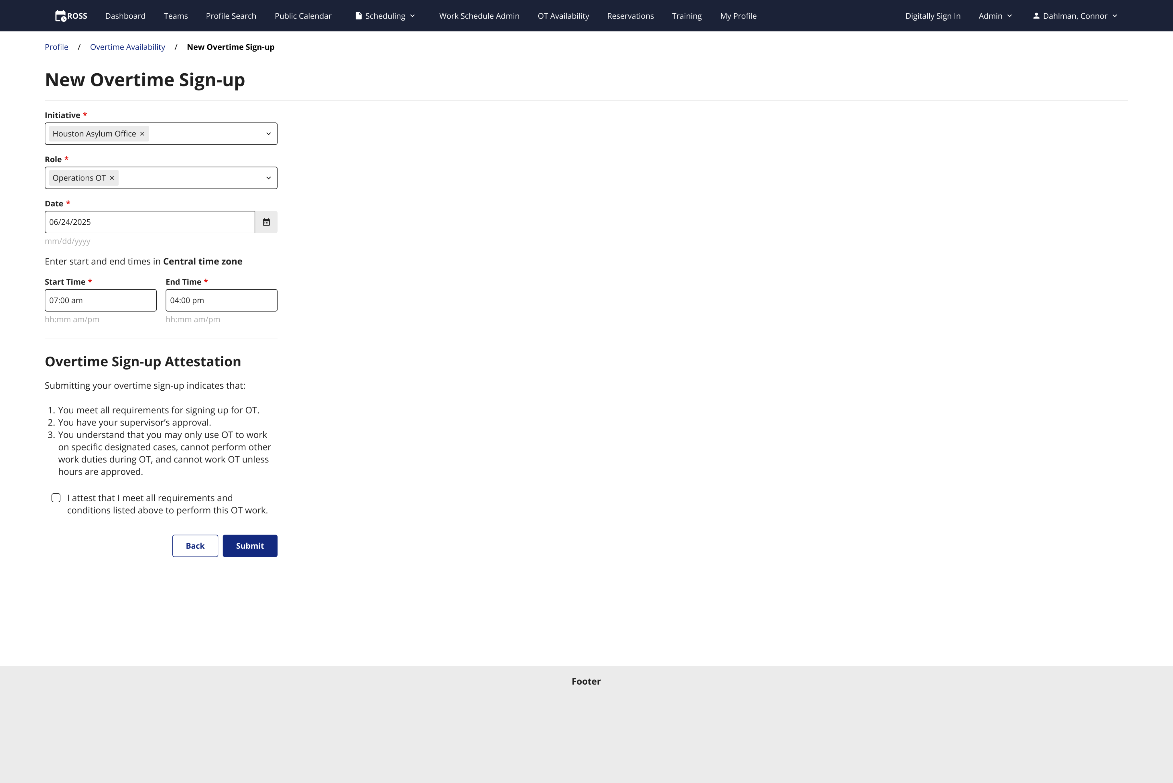
New form: vertical layout, grouped content, new attestation, breadcrumb navigation
Conclusion
I redesigned an outdated user flow that saves USCIS officers hundreds of combined hours per day, and the USCIS millions of dollars every year. I am also working to improve other edit flows across ROSS where I can by changing horizontally laid out forms to vertically laid out forms. My designs have positively impacted thousands of USCIS employees and saved a lot of money.
Disclaimer: All screenshots in this case study are representations of the ROSS application. They include no PII or sensitive USCIS data.
Check out the next case study
Updating tedious workflows for a federal enterprise app
A series of UX improvements for a federal time tracking & scheduling app.
Learn more
Saving the USCIS over $400,000 per year by fixing a broken user flow
TLDR
I reduced the table editing flow for all tables across the ROSS application from a 4 screen process to a single modal, saving USCIS employees hundreds of combined work hours per month, and the USCIS saves hundreds of thousands of dollars per year.
Old, broken flow
Multi-screen flow to get to the edit page for each row in the table.
Updated flow
A single click opens the modal over the table for quick, easy editing.
The user, time, & money
ROSS has just over 4,000 daily users. These users are federal employees that include interviewing officers, schedulers, floor managers, and administrators.
In order for ROSS users to edit any table information within the app, they needed to go through a 4 screen process for each edit. Multiply the time it takes to get to the edit screen by the 4,000 ROSS users, and again by many multiple edits per day. It adds up to hundreds of wasted hours every month.
The time
x
4,000 daily ROSS users
x
10 edits per day on average
x
5 seconds of wasted time per edit
x
200,000 wasted seconds per day
200,000 seconds is equal to 55 hours, the number of hours USCIS officers waste on this bad flow every day.
The daily cost
x
55 wasted hours per day
x
$31.25 average hourly rate for USCIS Officer’s salary
x
$1,718.75 spent daily on a bad user flow
Based on the average USCIS officer’s salary of $65,000 per year, $1,718.75 is wasted every single day.
The yearly cost
x
$1,718.75 bad user flow daily cost
x
249 working days per year
x
$427,968 saved per year
$1,718.75 per day is $4,326,375 per year, counting all working days.
This is a very conservative estimate that only includes the time saved by navigating to the edit screen. After usability testing, users were able to fill out the form in the modal much faster as well.
I used an app called Matomo to track the time users were spending on various tasks while they used ROSS. Matomo allowed me to see the time it took for users to go from one page to another, and the time it took for users to fill out forms.
Improved usability
This above estimate is only the monetary gain. Users were much happier with the streamlined flow, stating that the multi-screen edit process was incredibly annoying. It forced them to look around for the proper buttons to click, and they had to think about what they were doing.
They also had to go through multiple loading screens to get to the edit page, which takes time and is annoying.
Now they are able to add new reservations or edit existing ones without breaking their concentration to think about how to navigate through a poor UI.
New vertical form design pattern
I designed this modal with a vertical layout for the form inputs, which is a design pattern I am implementing wherever I can across ROSS. Vertical forms match how people read and scan pages, from top to bottom and left to right. Users naturally scroll vertically, so vertical forms suit natural human behavior.
Old edit form
New edit form
Vertical forms have shorter fields which improve readability. Short lines are more easily scanned than long lines of text or inputs. Vertical layouts also help structure the content in a logical way. Fill out the items on the top and move down the form. This matches the user’s expectations from using smartphones.
There are a few forms on ROSS that require the user to scroll horizontally to fill out all the fields. This is an unnatural and confusing way to fill out a form. Vertical layouts, on the other hand, are what users expect when filling out a form.
Vertical forms are easier for users to scan, understand, and complete.
After sharing this design with the product team, I proposed that we start changing all forms on ROSS to vertical rather than horizontal, along with grouping related fields when possible. The product team liked this idea, and every time I see a form in ROSS that’s related to a redesign or new feature, I change the layout of the form as well.
New overtime sign-up page
I redesigned this overtime sign-up flow and added an attestation section. I also rearranged the form to be vertical instead of horizontal, grouped the content, and added breadcrumb navigation (another design pattern I’ve been implementing whenever I can).
Old OT form
Old form: poor layout, no backtracking navigation, no attestation
New OT form
New form: vertical layout, grouped content, new attestation, breadcrumb navigation
Conclusion
I redesigned an outdated user flow that saves USCIS officers hundreds of combined hours per day, and the USCIS millions of dollars every year. I am also working to improve other edit flows across ROSS where I can by changing horizontally laid out forms to vertically laid out forms. My designs have positively impacted thousands of USCIS employees and saved a lot of money.
Disclaimer: All screenshots in this case study are representations of the ROSS application. They include no PII or sensitive USCIS data.
Check out the next case study
Updating tedious workflows for a federal enterprise app
A series of UX improvements for a federal time tracking & scheduling app.
Learn more