Updating more tedious workflows across ROSS with user data from Matomo
TLDR
I introduced bulk actions to the ROSS tables, improved the UI by implementing a scalable actions column, and I updated the filter flow based on user data I collected with Matomo.
The ask
During one of our monthly meetings with the ROSS Schedulers, they asked if we could allow them to delete multiple rows at once. In the previous flow, they had to click the remove button for each row they wanted to delete, and confirm that they wanted to complete the action. Schedulers sometimes remove dozens of rows at a time, so this process was taking them a very long time, and they wanted something more efficient.
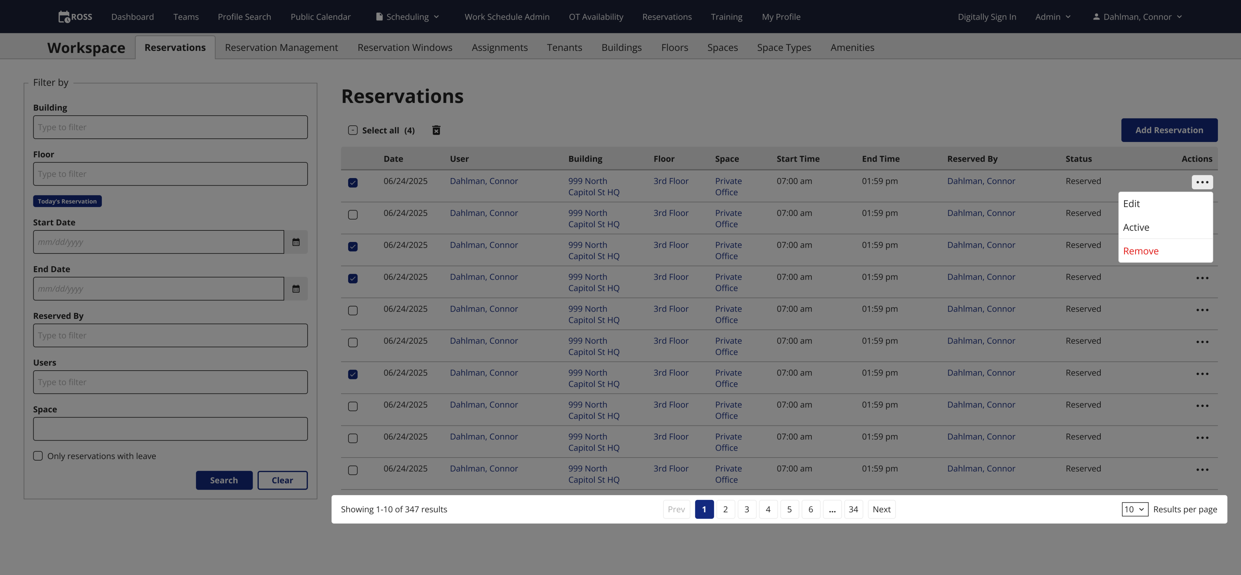
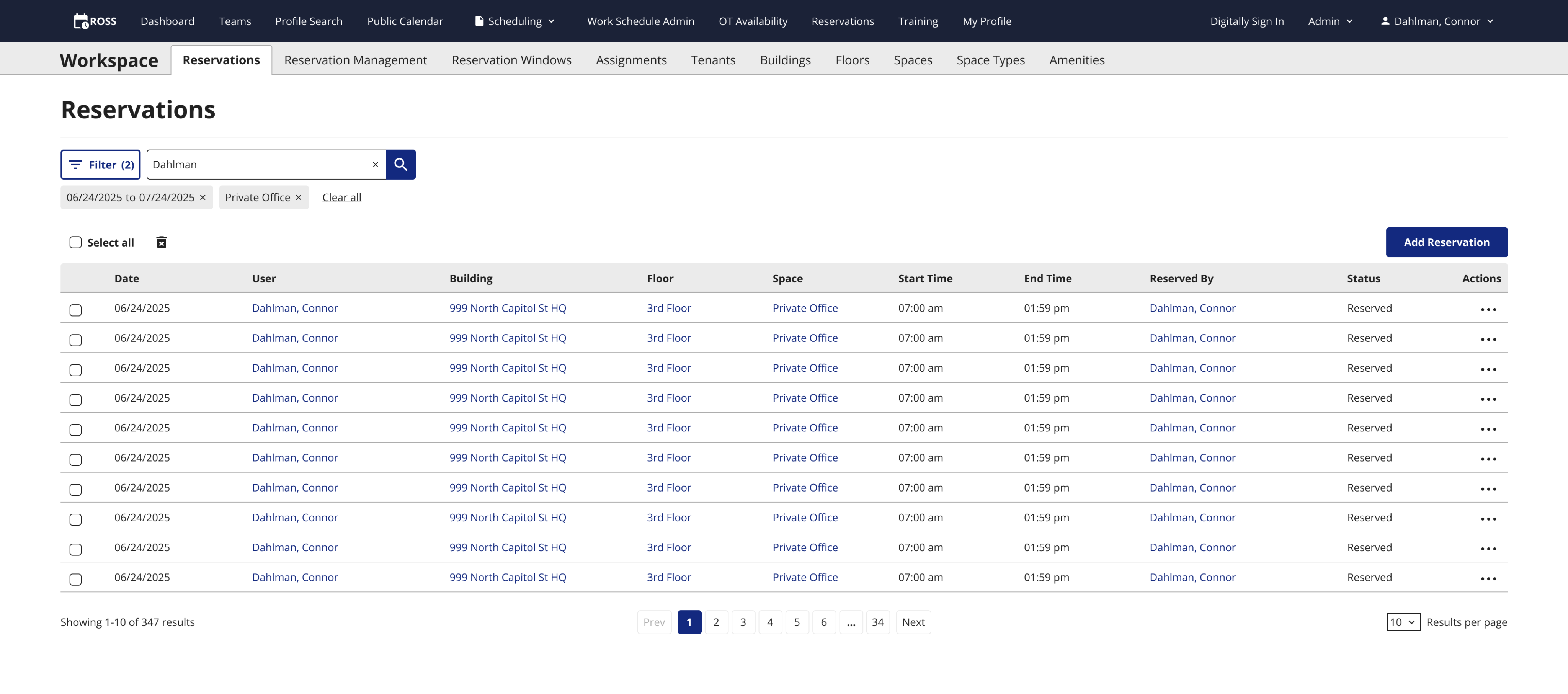
The old table
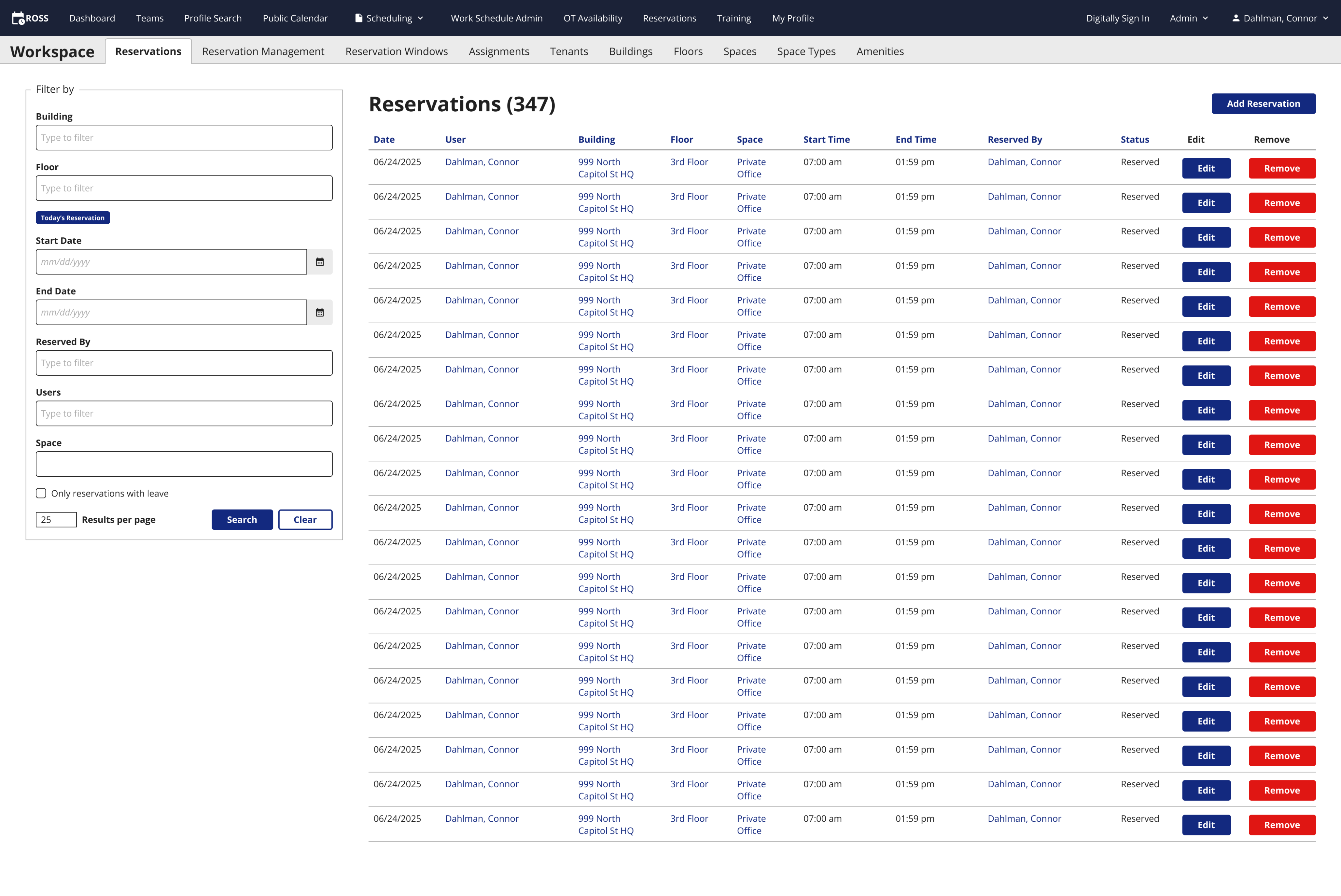
After clicking the Remove button, a confirmation modal would appear every time.
The answer
I added a checkbox system to the tables that allows users to select multiple rows at one time. Once a single row is selected, a remove button appears next to the select all button above the table header. Clicking the remove button still brings up the confirmation modal, but you only have to confirm the action one time to remove as many rows as you want.
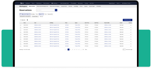
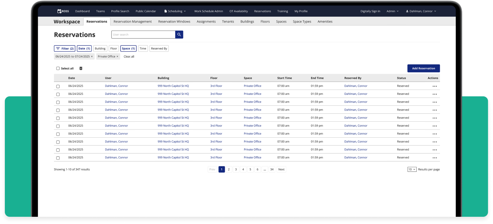
The new table
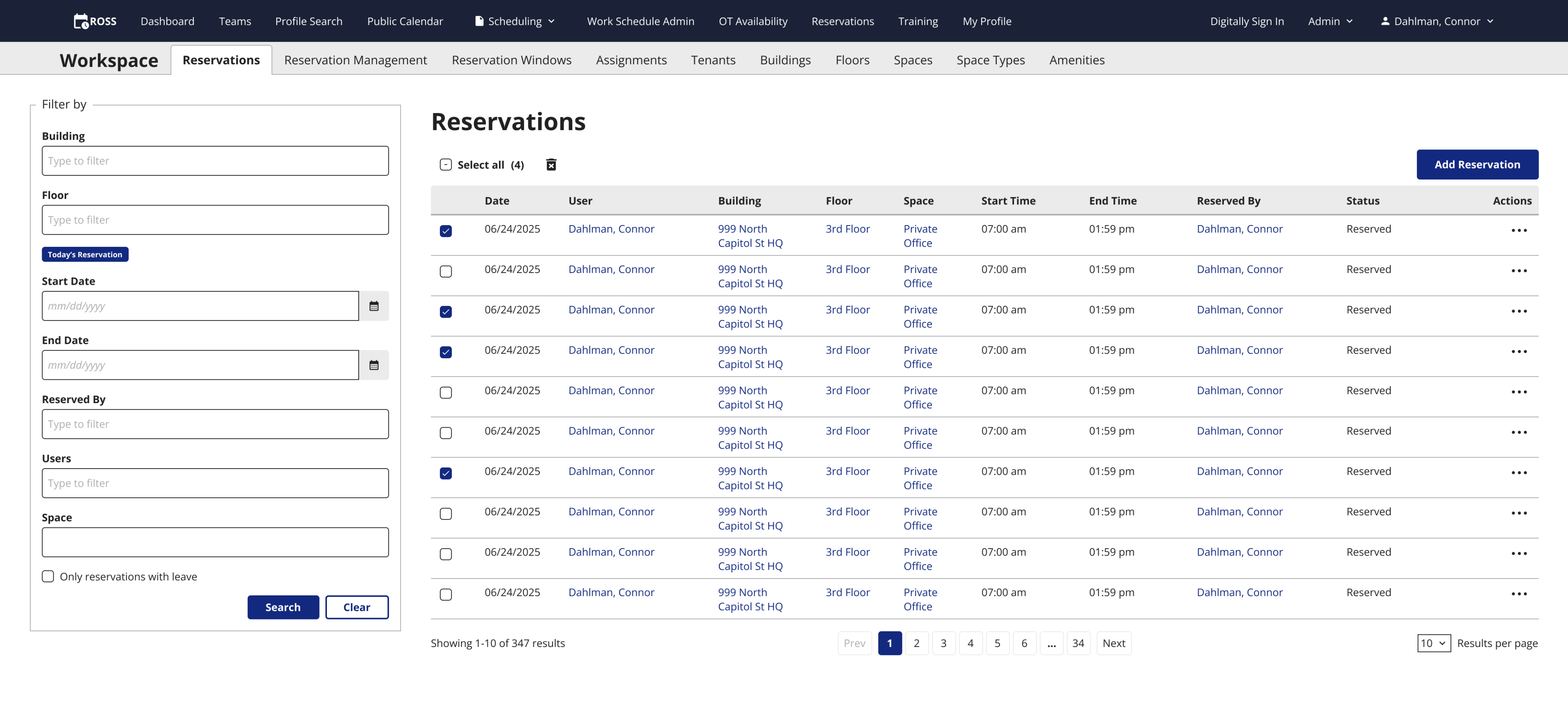
Users can remove reservations with either the actions column or the checkboxes.
Extra credit
I took this task as an opportunity to update other aspects of how users interact with tables on ROSS, and clean up the UI at the same time.
Many of the UI elements on ROSS were added without any input from designers. This includes the filtering system and the columns of edit and remove buttons on the table.
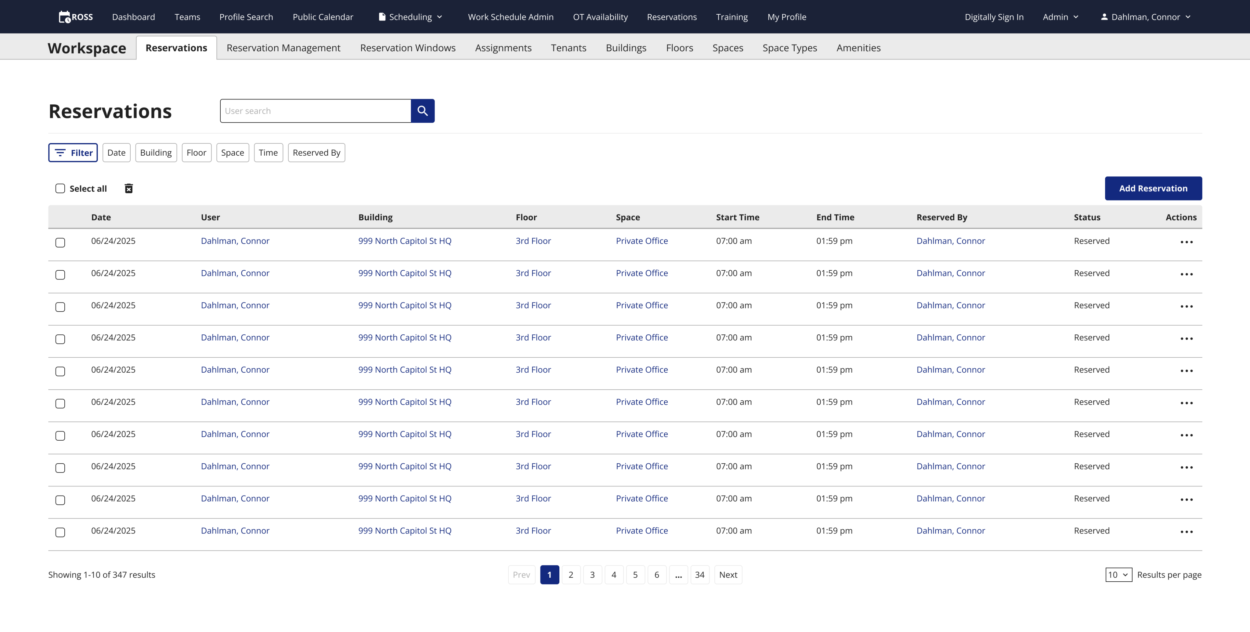
Table actions
I combined the edit and remove columns into a single action column. not only does it make the table look better, it is a scalable design pattern that can be expanded upon to include more actions if ROSS ever needs it.
These new actions column and checkbox patterns are things that did not exist in the DID(it) design system since it’s still in its infancy. I shared these patterns with the design system team so that they can add it to the design system and improve other apps across DID(it).
I removes the results per page component from the filter and added it to the table since they should be more closely associated, and that is a pattern that exists in our design system.
New actions column & table controls
Added table actions column and results per page component to the table.
Table feedback
The users are very happy with the new table controls. They are able to remove multiple reservations at once, and the table controls under the table are intuitive.
The business is happy with this updated table design as well. We will be using across other tables within ROSS that require bulk removal or edit actions.
Filters & Matomo
I used an application called Matomo to track user interactions across most filter forms in ROSS. I found that on most tables, users never used the filter at all. On the tables where they did filter for something, the vast majority of users only filtered with one option and never touched the other filter options.
This means that this large filter exists on all table pages, taking up a lot of vertical space, forcing some tables to use vertical scrolling which isn’t good, and most users either don’t use it, or they only use one option.
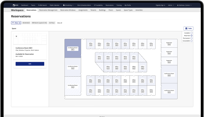
New table, old filter
The filter takes up a lot of real estate on the screen, and most people don’t use all those options.
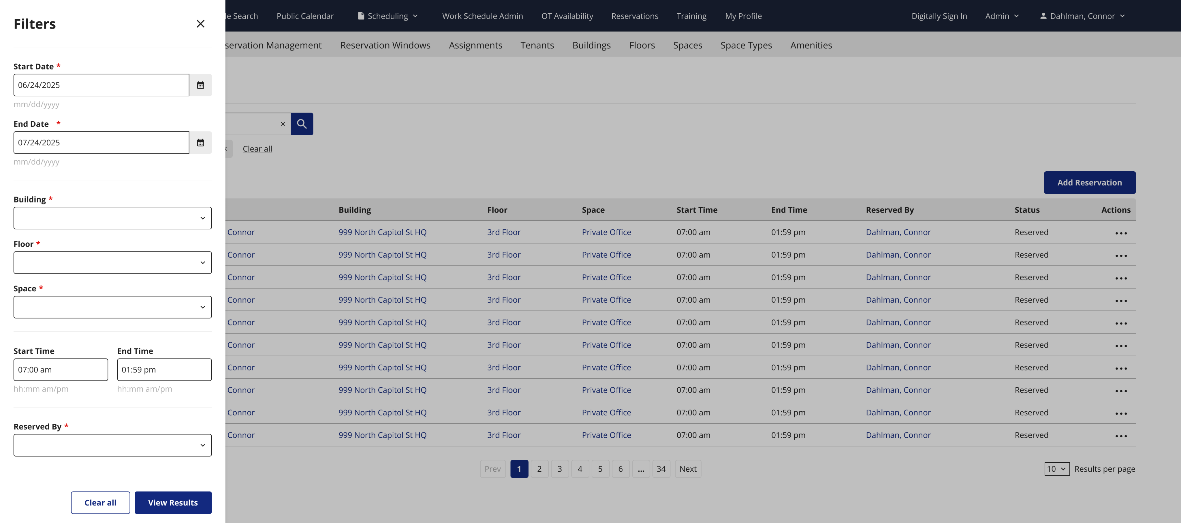
I designed a new filter system that uses pills above the table, along with a search type component for the one filter option that people use the most on that table. Clicking the filter pills opens a tray on the left side of the screen where users can choose what options they want, and the positioning of the options in the tray lines up with where the user’s mouse is when they click the filter pills.
Many popular e-commerce websites use a filtering system with pills like this, so it should be a familiar design pattern that users recognize.
This new system takes up slightly more vertical space, but it adds tons of horizontal space to allow the tables to be more spread out, making them easier to scan, and removing vertical scrolling from the few tables that had it.
New filter design
The new filter uses small pills and a search field above the table.
Open filter
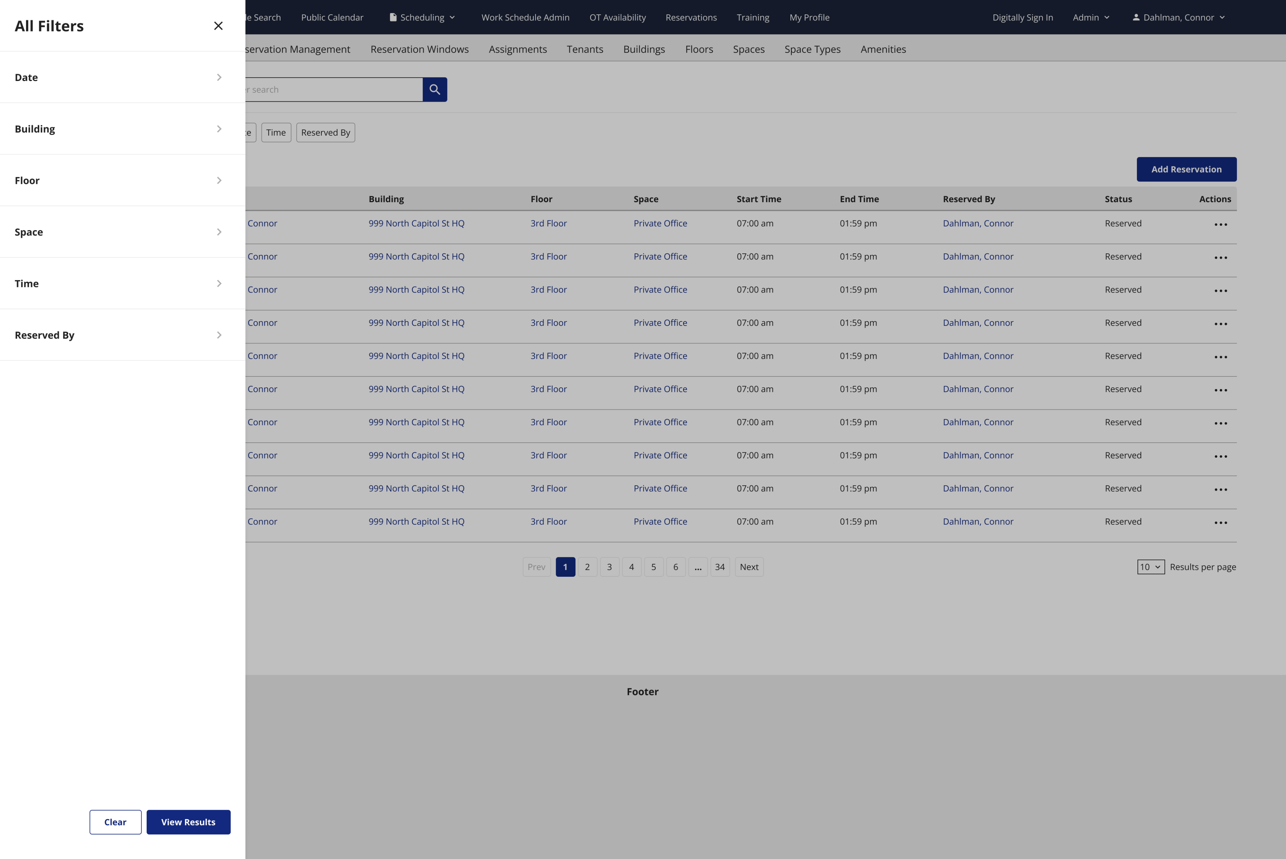
The other options are organized by category, and clicking one allows you to apply that filter.
Applied filters
When a filter is selected, it appears under the pills with the option to clear it.
Filter feedback
This new filtering system was heading in the right direction, but it was too complicated and would require too much time to develop. The stakeholders agreed that the current filter was taking up too much space for the few people that actually used it, and they liked the concept I proposed, but it was just a bit too complicated, and there were a few things that were redundant.
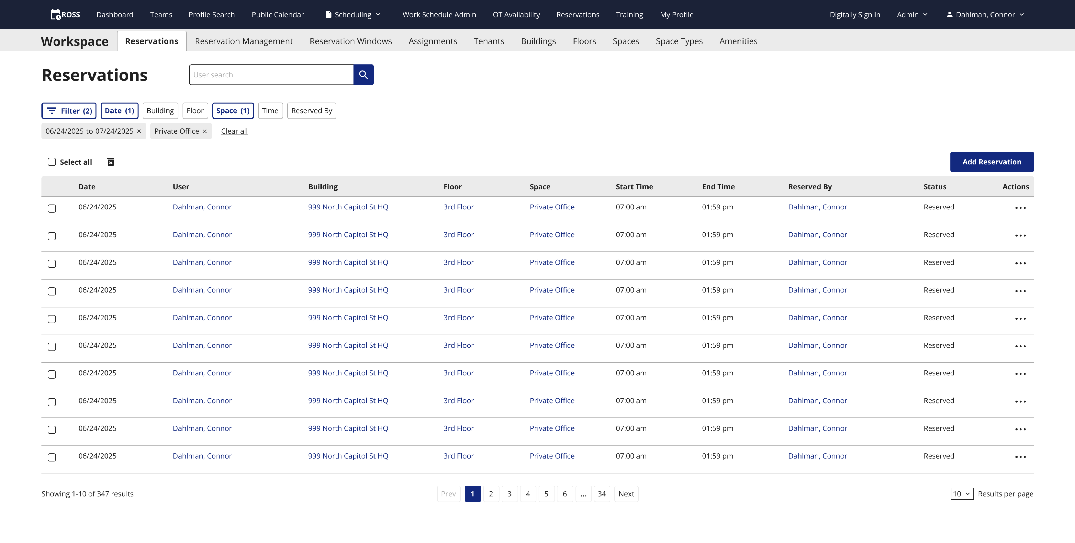
I first changed the filter pills. The stakeholders informed me that the users won’t need to see all of the filter options like how I have it displayed above. Just a filter button and the search bar would be enough for the users to understand how to use it.
Updated filter
When a filter is selected, it appears under the pills with the option to clear it.
The second thing I changed was the many different versions of the tray that slides out when you click the filter button. Now, instead of having multiple layers with each individual filter singled out, all filters live on the same level, the first and only one that opens when you click the filter button.
Updated filter tray
All filters appear when you click the filter button
Conclusion
The product team likes this version much more and the stakeholders are now happy with the functionality. These designs will go into development soon, and I will be able to gather user feedback after that.
Disclaimer: All screenshots in this case study are representations of the ROSS application. They include no PII or sensitive USCIS data.
Check out the next case study
New feature design for federal enterprise software
Creating a map view for a table of reserved and available office spaces.
Learn more
Updating more tedious workflows across ROSS with user data from Matomo
TLDR
I introduced bulk actions to the ROSS tables, improved the UI by implementing a scalable actions column, and I updated the filter flow based on user data I collected with Matomo.
The ask
During one of our monthly meetings with the ROSS Schedulers, they asked if we could allow them to delete multiple rows at once. In the previous flow, they had to click the remove button for each row they wanted to delete, and confirm that they wanted to complete the action. Schedulers sometimes remove dozens of rows at a time, so this process was taking them a very long time, and they wanted something more efficient.
The old table
After clicking the Remove button, a confirmation modal would appear every time.
The answer
I added a checkbox system to the tables that allows users to select multiple rows at one time. Once a single row is selected, a remove button appears next to the select all button above the table header. Clicking the remove button still brings up the confirmation modal, but you only have to confirm the action one time to remove as many rows as you want.
The new table
Users can remove reservations with either the actions column or the checkboxes.
Extra credit
I took this task as an opportunity to update other aspects of how users interact with tables on ROSS, and clean up the UI at the same time.
Many of the UI elements on ROSS were added without any input from designers. This includes the filtering system and the columns of edit and remove buttons on the table.
Table actions
I combined the edit and remove columns into a single action column. not only does it make the table look better, it is a scalable design pattern that can be expanded upon to include more actions if ROSS ever needs it.
These new actions column and checkbox patterns are things that did not exist in the DID(it) design system since it’s still in its infancy. I shared these patterns with the design system team so that they can add it to the design system and improve other apps across DID(it).
I removes the results per page component from the filter and added it to the table since they should be more closely associated, and that is a pattern that exists in our design system.
New actions column & table controls
Added table actions column and results per page component to the table.
Table feedback
The users are very happy with the new table controls. They are able to remove multiple reservations at once, and the table controls under the table are intuitive.
The business is happy with this updated table design as well. We will be using across other tables within ROSS that require bulk removal or edit actions.
Filters & Matomo
I used an application called Matomo to track user interactions across most filter forms in ROSS. I found that on most tables, users never used the filter at all. On the tables where they did filter for something, the vast majority of users only filtered with one option and never touched the other filter options.
This means that this large filter exists on all table pages, taking up a lot of vertical space, forcing some tables to use vertical scrolling which isn’t good, and most users either don’t use it, or they only use one option.
New table, old filter
The filter takes up a lot of real estate on the screen, and most people don’t use all those options.
I designed a new filter system that uses pills above the table, along with a search type component for the one filter option that people use the most on that table. Clicking the filter pills opens a tray on the left side of the screen where users can choose what options they want, and the positioning of the options in the tray lines up with where the user’s mouse is when they click the filter pills.
Many popular e-commerce websites use a filtering system with pills like this, so it should be a familiar design pattern that users recognize.
This new system takes up slightly more vertical space, but it adds tons of horizontal space to allow the tables to be more spread out, making them easier to scan, and removing vertical scrolling from the few tables that had it.
New filter design
The new filter uses small pills and a search field above the table.
Open filter
The other options are organized by category, and clicking one allows you to apply that filter.
Applied filters
When a filter is selected, it appears under the pills with the option to clear it.
Filter feedback
This new filtering system was heading in the right direction, but it was too complicated and would require too much time to develop. The stakeholders agreed that the current filter was taking up too much space for the few people that actually used it, and they liked the concept I proposed, but it was just a bit too complicated, and there were a few things that were redundant.
I first changed the filter pills. The stakeholders informed me that the users won’t need to see all of the filter options like how I have it displayed above. Just a filter button and the search bar would be enough for the users to understand how to use it.
Updated filter
When a filter is selected, it appears under the pills with the option to clear it.
The second thing I changed was the many different versions of the tray that slides out when you click the filter button. Now, instead of having multiple layers with each individual filter singled out, all filters live on the same level, the first and only one that opens when you click the filter button.
Updated filter tray
All filters appear when you click the filter button
Conclusion
The product team likes this version much more and the stakeholders are now happy with the functionality. These designs will go into development soon, and I will be able to gather user feedback after that.
Disclaimer: All screenshots in this case study are representations of the ROSS application. They include no PII or sensitive USCIS data.
Check out the next case study
New feature design for federal enterprise software
Creating a map view for a table of reserved and available office spaces.
Learn more