New feature design for federal enterprise software
TLDR
I added a new feature for admin users to view, edit, and add reservations on a map instead of just the table.
The ask
On the “front end” of ROSS, the place non-admin users do things, users are able to reserve office spaces using a map. They select the date, building, and floor, and a modal opens showing them the floor map with available and unavailable office spaces for that floor on that date.
Admin users view all reservations on the “back end” of ROSS, or the admin side of the app. They view all existing reservations on the Reservations Table, and they can create new reservations by clicking the Add Reservation button which opens a modal (read how I designed that here).
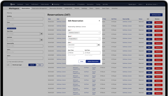
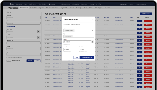
The admin reservations table

Admins can view, add, and edit reservations on this table.
Admins wanted a way to view the reservations like users can on the front end, but with more functionality. On the front end maps, users can only choose an available space, they can’t interact with unavailable spaces, which includes permanently assigned offices. Admins also needed to be able to edit permanent spaces as well, since the offices were quickly filling up again with the new administrations return to office policy.
To recap, admins wanted to view reserved and available spaces on a floor map like on the front end, and they needed to be able to edit all reservations, including permanent spaces, and create new reservations.
The new admin reservations map
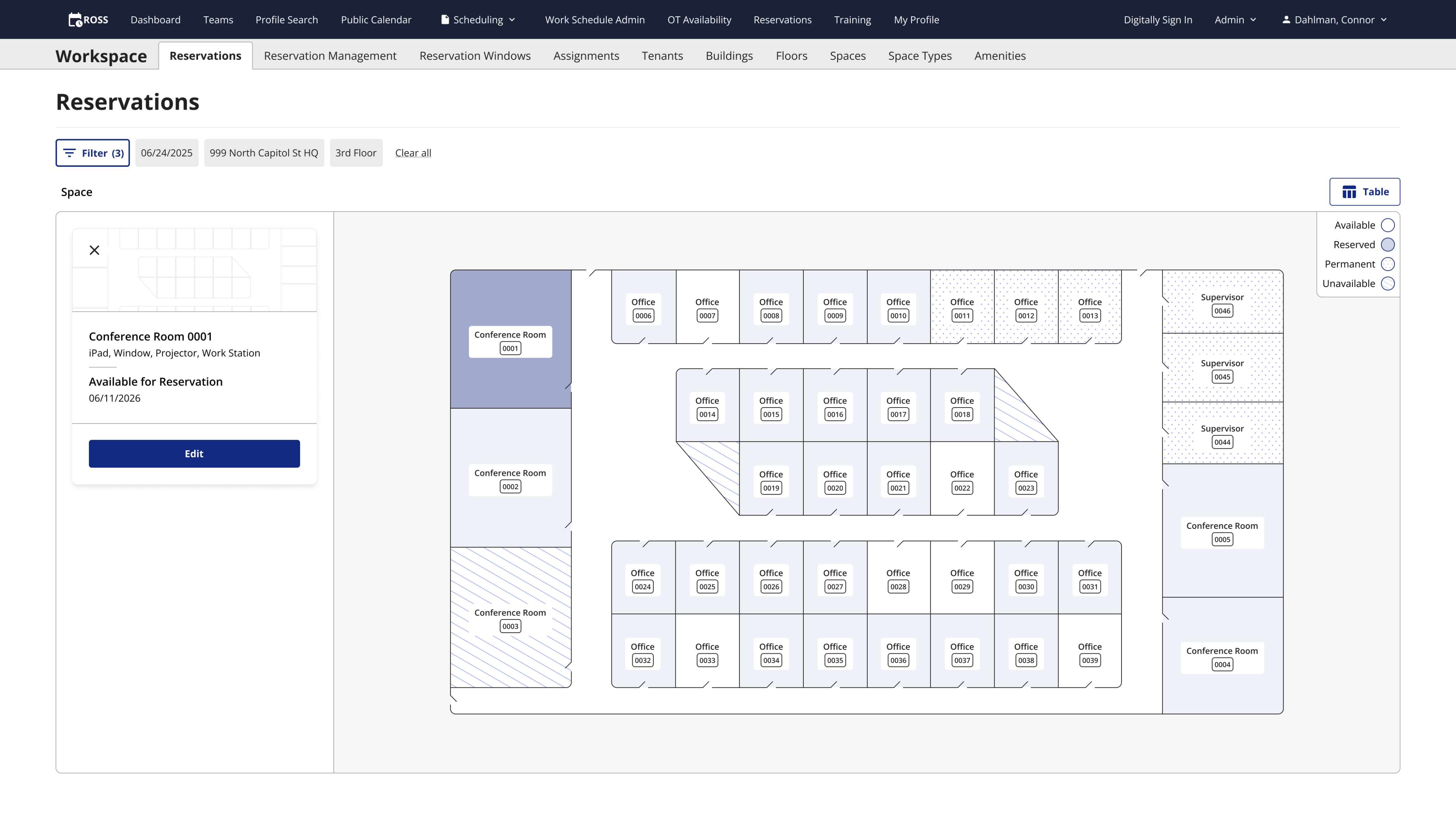
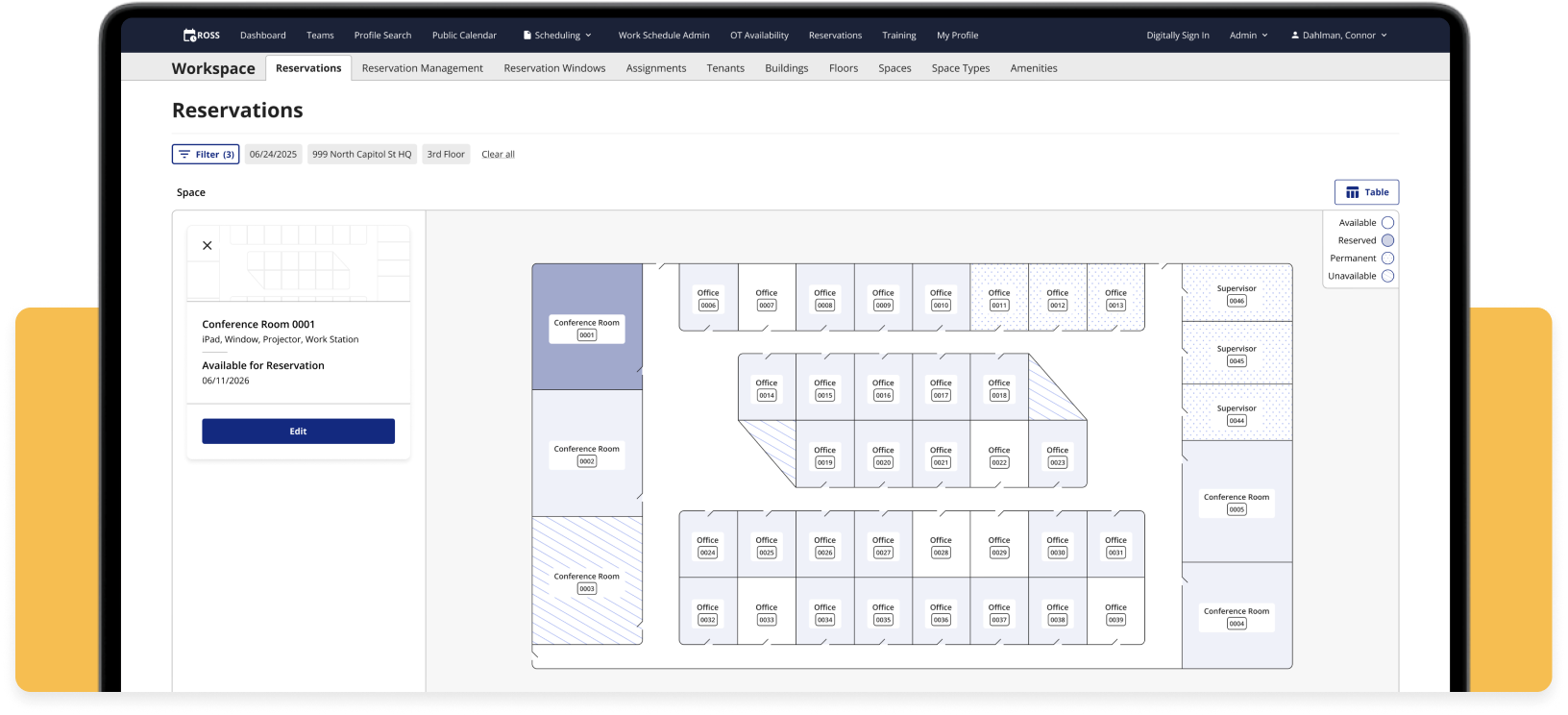
Admins can now view, add, and edit reservations with this map.
Filters
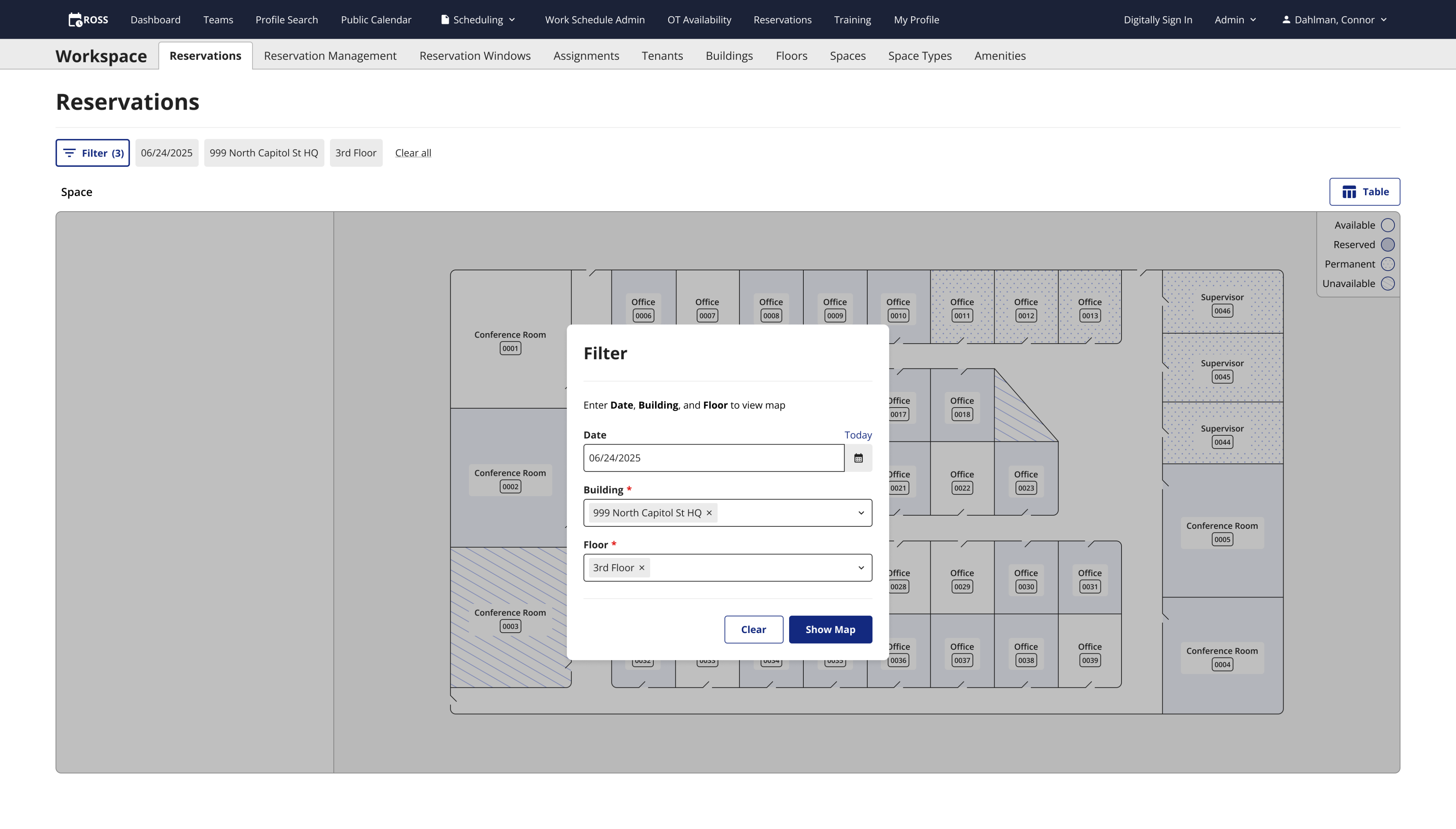
In order to view any floor map, the system would need to know which building and floor the admin wants to look at, and for which date. I implemented a modified version of my new filter design pattern on this page (read about it here). When an admin opens the map for the first time, they are greeted with the filter to choose the date, building, and floor. After clicking Show Map, the floor map populates, and the selected filter options are shown above the map.
This filter system is different from the original because it would be difficult and confusing to try to show a floor map with the building, floor, or date missing. Clearing the filters or clicking the filter pill opens the filter modal over the map, and admins can choose to view a different floor, and they can change the date if they want.
The opening filter
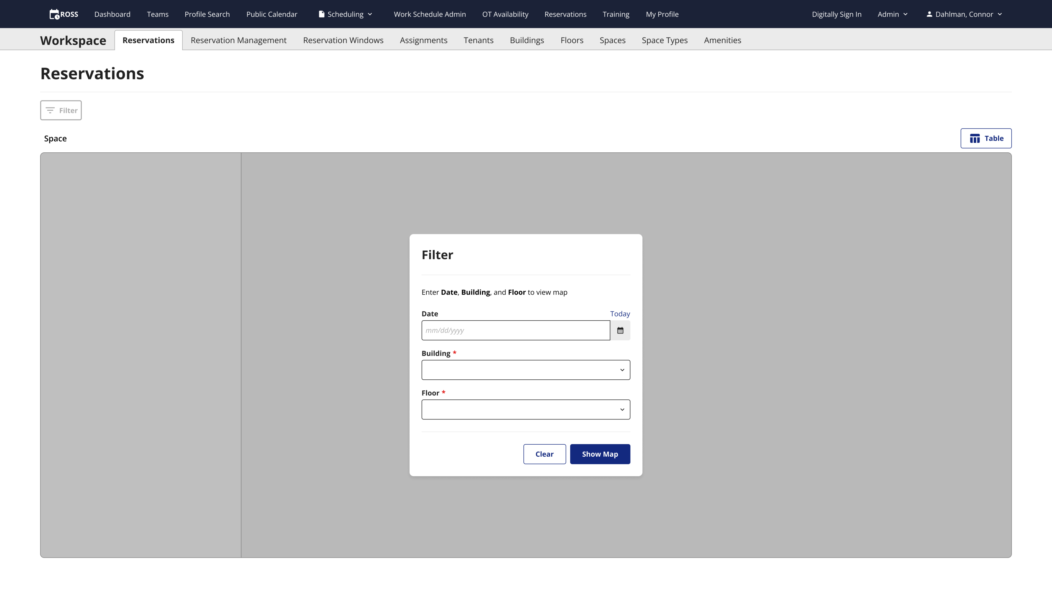
The system requires these fields to show the desired map.
Filtering again
Admins can open the filter to view different reservations.
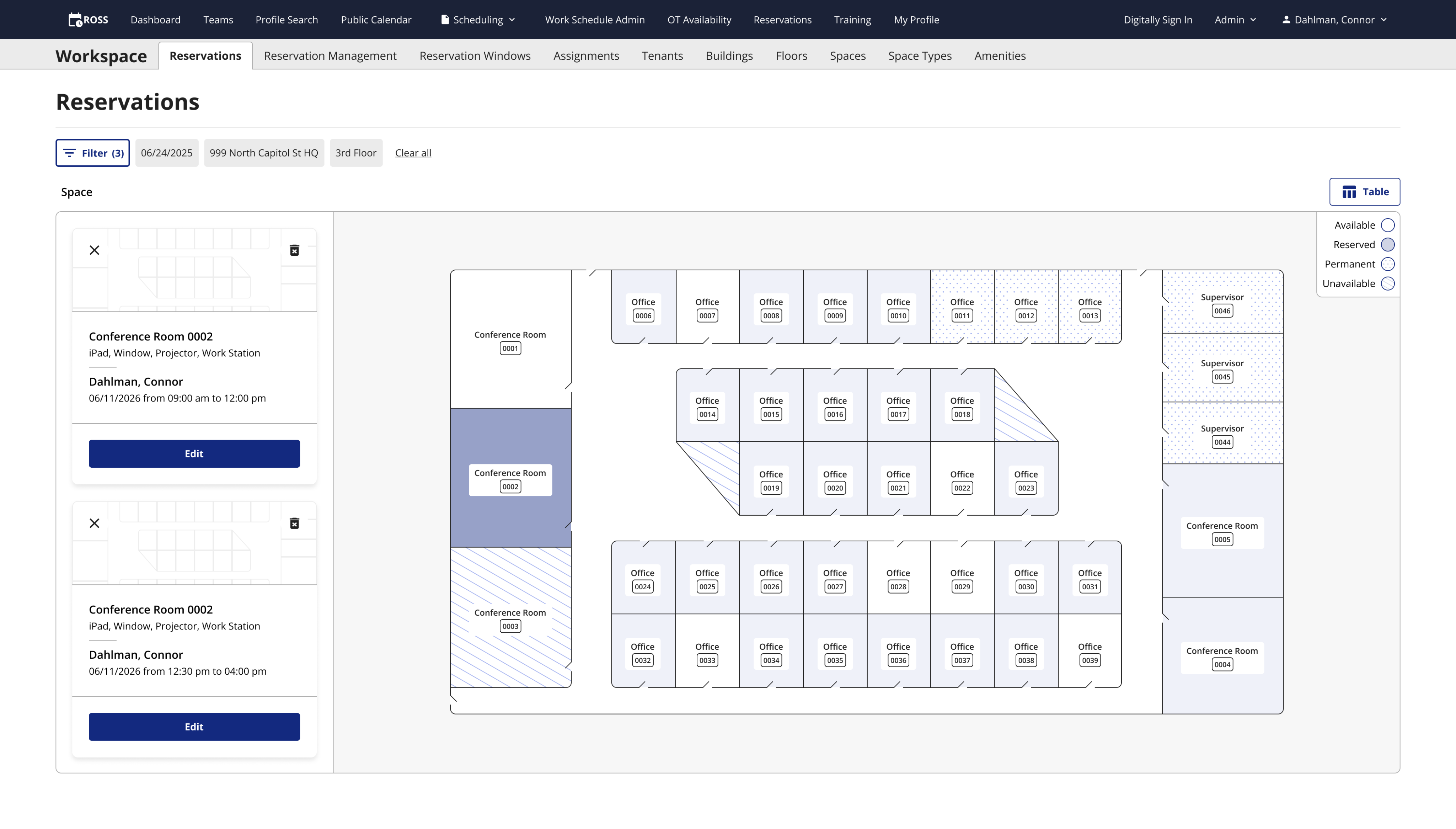
Interactive map
The admin map needed to be different from the front end map because it is much more complicated. There are 4 possible states that an office space can be; available, reserved, permanently assigned, and unavailable. On the front end, spaces are either available or not so you can really only do one thing. On this map, users have much more control as they can modify reservations as well.
In order to show the different space states in an accessible way, I created a legend using patterns instead of colors. Patterns allow for all sighted users to visually determine which office space they’re looking at, while differentiating by color would not allow some color blind folks to see the difference, even with the legend.
I originally used colors to differentiate the rooms in my early designs, but I was inspired by the calendar on Microsoft Outlook of all things. The meetings on my calendar had similar states to the office spaces. There could be pending meetings, meetings I’ve accepted, or even canceled meetings. All of them were orange, and they used different patterns to let you know which was which. I adopted this pattern of using patterns for my own designs and used blank space for available spaces, a solid light blue for reserved spaces, dots for a permanently assigned space, and diagonal lines for unavailable spaces. I also created a small legend and put it in the top right corner of the map.
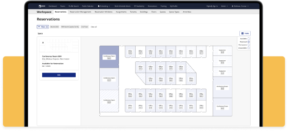
New map design
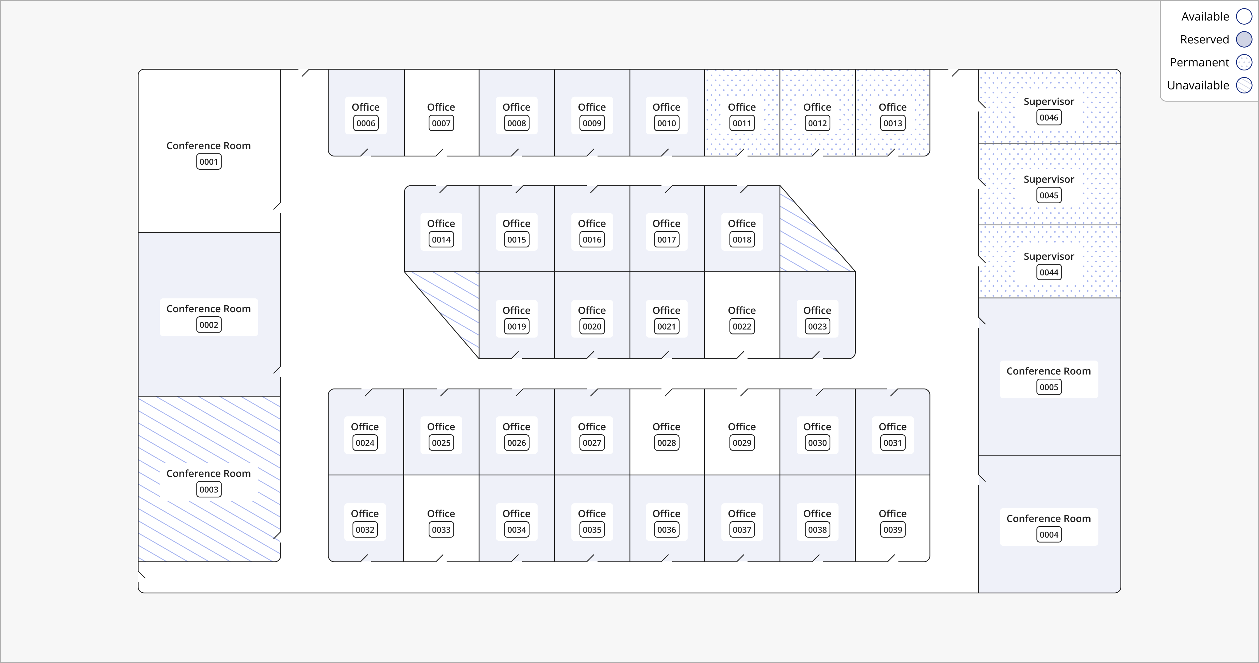
Zoomed in view of the map.
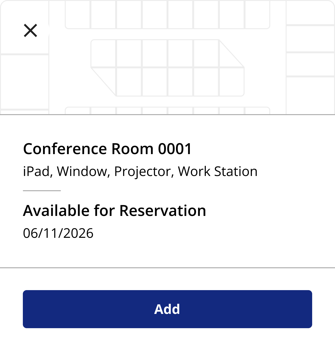
Space cards
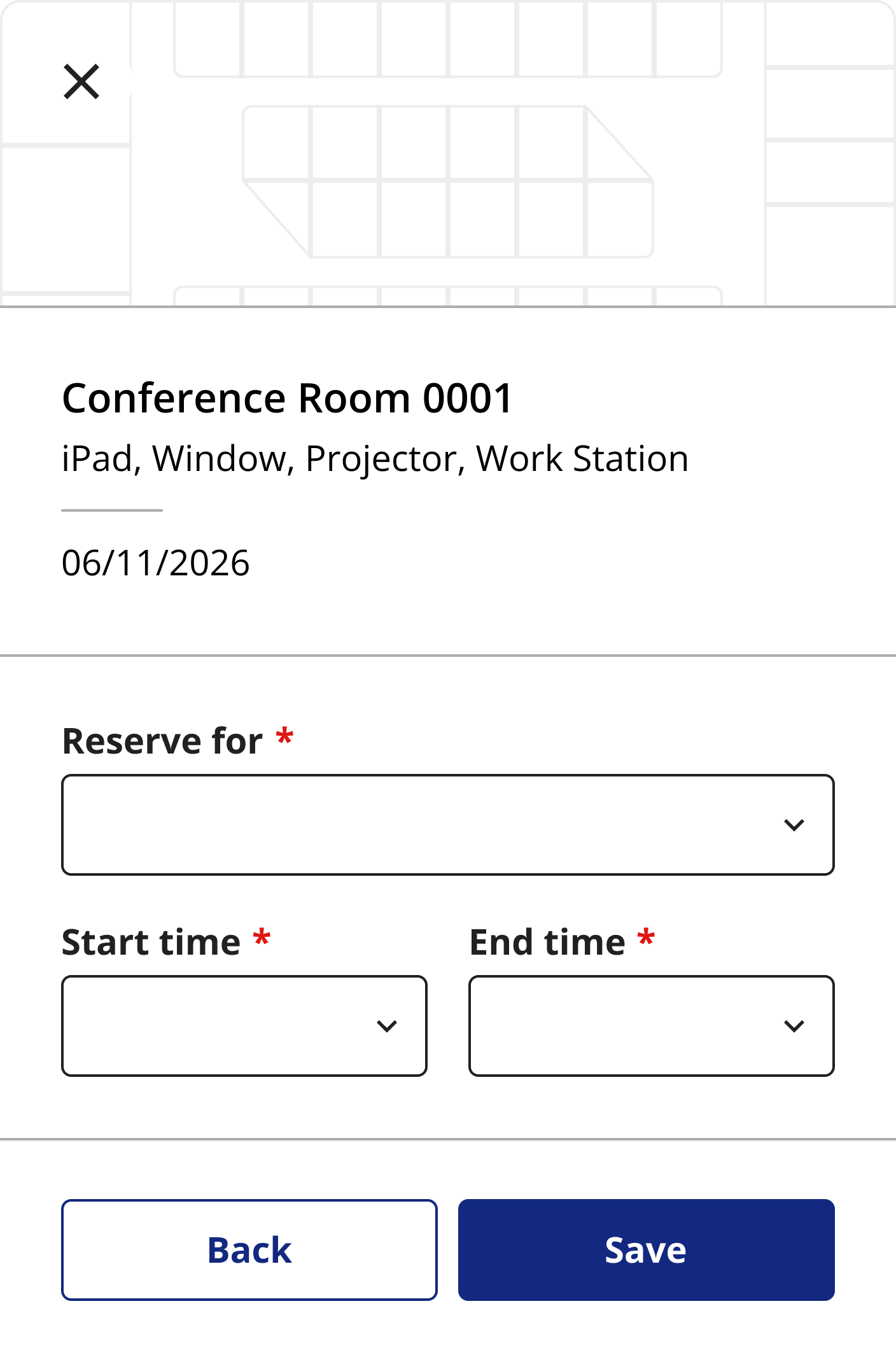
Once a user clicks a space on the map, a card with that space’s information appears to the left of the map. Like the spaces, the card has multiple states; available, reserved, and permanently assigned. If a space is reserved, the card will show the user’s name and time they have the space reserved for. If the space is available, the card says available in place of the user’s name.
I had some fun designing the UI for the cards by adding a small map graphic to the top for a bit of flair. The ROSS stakeholders love maps, and we use it as a background texture on the front end reservations page. Within the top section are an X to get rid of the card and deselect the space on the map, and a trash can icon for deleting the reservation if it has one. The top of the card shows the space’s name and the amenities available in that space, and below that shows the user’s name (if reserved) and the date.
Available card
Reserved card

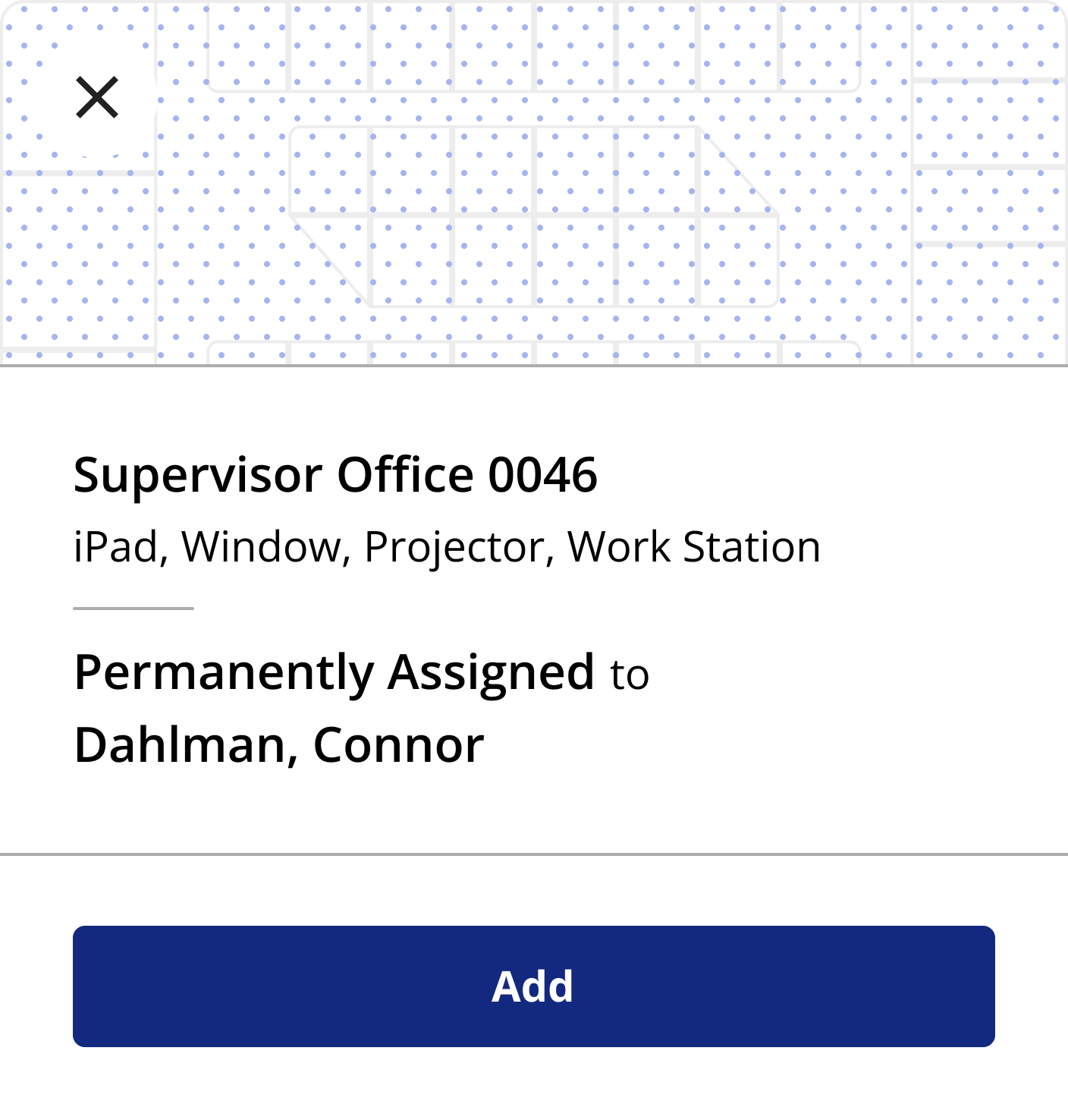
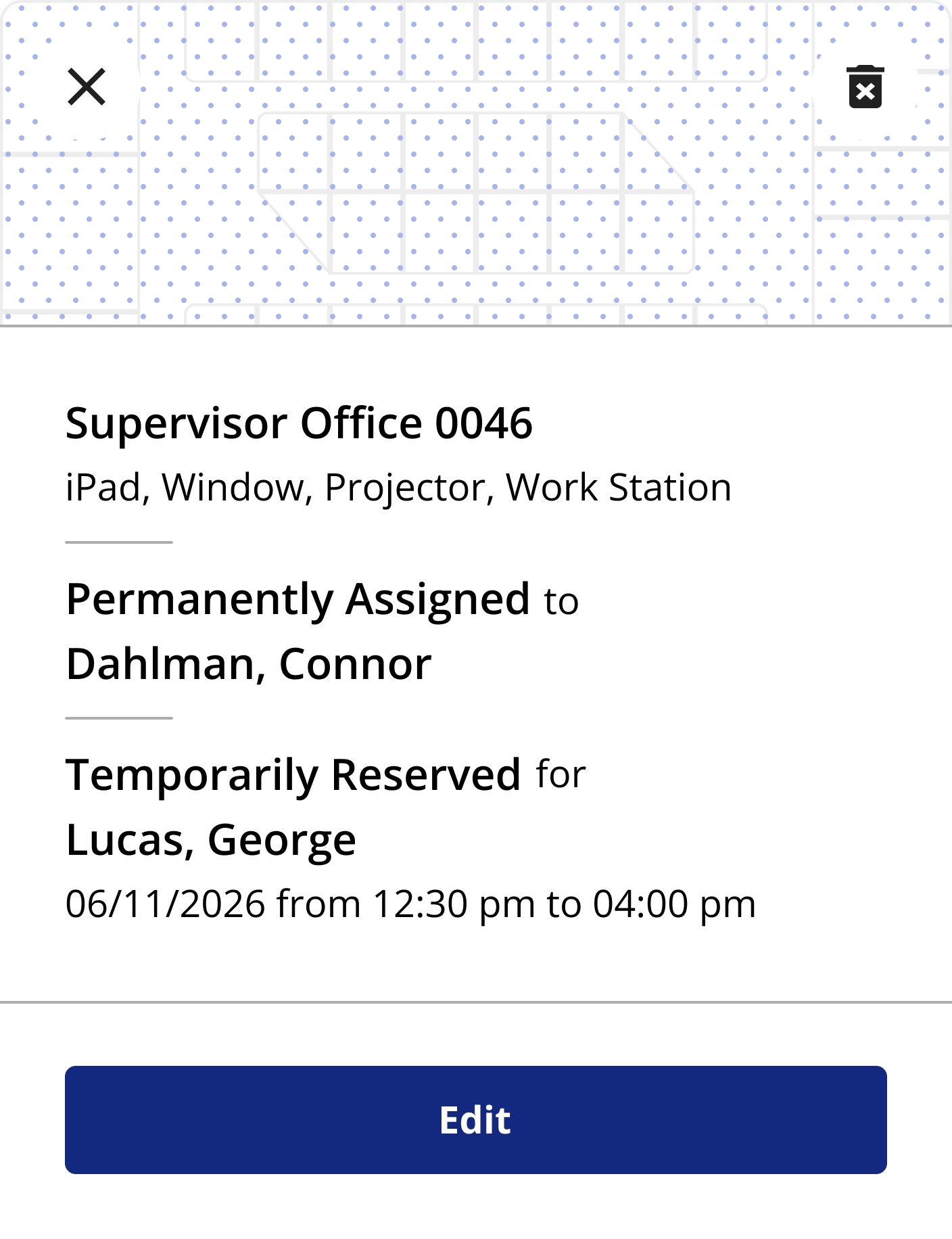
For permanently assigned spaces, I overlaid the dot pattern above the map so it matches the legend, and it shows the user that the space is permanently assigned to. Admins needed to be able to temporarily assign people to permanent spaces because there weren’t enough spaces to accommodate all the employees that returned to the office, and when a user with a permanent space went on vacation or was out sick, their office went unused. Now, admins could ensure every single office space was being utilized every day.
When a user clicks a space on the map to view the space card, they can click the Edit button to either add a new reservation, modify an existing one, or temporarily assign someone to a permanent space.
Permanently assigned card
Permanently assigned card with
temp reservation
When a user clicks a space on the map to view the space card, they can click the Edit button to either add a new reservation, modify an existing one, or temporarily assign someone to a permanent space.
Available card edit state
Looking to the future
In the designs shown in this case study, users are able to choose a time range for which they will reserve that space. This does not currently exist in production, but the stakeholders asked that we find a way to allow a single space to be reserved multiple times per day. ROSS does not have that functionality at this time, but we are looking into adding it. I designed this cards system with that ask in mind, and if an admin clicks a space with 2 or more reservations in a single day, the cards will stack in the column to the left of the map.
2 reservations for the same space
Video of the interaction
Check out this video to see how it all fits together.
Disclaimer: All screenshots in this case study are representations of the ROSS application. They include no PII or sensitive USCIS data.
Check out the next case study
Saving the USCIS over $400,000 per year
Designing a workflow that saves federal employees hundreds of combined hours per month.
Learn more
New feature design for federal enterprise software
TLDR
I added a new feature for admin users to view, edit, and add reservations on a map instead of just the table.
The ask
On the “front end” of ROSS, the place non-admin users do things, users are able to reserve office spaces using a map. They select the date, building, and floor, and a modal opens showing them the floor map with available and unavailable office spaces for that floor on that date.
Admin users view all reservations on the “back end” of ROSS, or the admin side of the app. They view all existing reservations on the Reservations Table, and they can create new reservations by clicking the Add Reservation button which opens a modal (read how I designed that here).
The admin reservations table
Admins can view, add, and edit reservations on this table.
Admins wanted a way to view the reservations like users can on the front end, but with more functionality. On the front end maps, users can only choose an available space, they can’t interact with unavailable spaces, which includes permanently assigned offices. Admins also needed to be able to edit permanent spaces as well, since the offices were quickly filling up again with the new administrations return to office policy.
To recap, admins wanted to view reserved and available spaces on a floor map like on the front end, and they needed to be able to edit all reservations, including permanent spaces, and create new reservations.
The new admin reservations map
Admins can now view, add, and edit reservations with this map.
Filters
In order to view any floor map, the system would need to know which building and floor the admin wants to look at, and for which date. I implemented a modified version of my new filter design pattern on this page (read about it here). When an admin opens the map for the first time, they are greeted with the filter to choose the date, building, and floor. After clicking Show Map, the floor map populates, and the selected filter options are shown above the map.
This filter system is different from the original because it would be difficult and confusing to try to show a floor map with the building, floor, or date missing. Clearing the filters or clicking the filter pill opens the filter modal over the map, and admins can choose to view a different floor, and they can change the date if they want.
The opening filter
The system requires these fields to show the desired map.
Filtering again
Admins can open the filter to view different reservations.
Interactive map
The admin map needed to be different from the front end map because it is much more complicated. There are 4 possible states that an office space can be; available, reserved, permanently assigned, and unavailable. On the front end, spaces are either available or not so you can really only do one thing. On this map, users have much more control as they can modify reservations as well.
In order to show the different space states in an accessible way, I created a legend using patterns instead of colors. Patterns allow for all sighted users to visually determine which office space they’re looking at, while differentiating by color would not allow some color blind folks to see the difference, even with the legend.
I originally used colors to differentiate the rooms in my early designs, but I was inspired by the calendar on Microsoft Outlook of all things. The meetings on my calendar had similar states to the office spaces. There could be pending meetings, meetings I’ve accepted, or even canceled meetings. All of them were orange, and they used different patterns to let you know which was which. I adopted this pattern of using patterns for my own designs and used blank space for available spaces, a solid light blue for reserved spaces, dots for a permanently assigned space, and diagonal lines for unavailable spaces. I also created a small legend and put it in the top right corner of the map.
New map design
Zoomed in view of the map.
Space cards
Once a user clicks a space on the map, a card with that space’s information appears to the left of the map. Like the spaces, the card has multiple states; available, reserved, and permanently assigned. If a space is reserved, the card will show the user’s name and time they have the space reserved for. If the space is available, the card says available in place of the user’s name.
I had some fun designing the UI for the cards by adding a small map graphic to the top for a bit of flair. The ROSS stakeholders love maps, and we use it as a background texture on the front end reservations page. Within the top section are an X to get rid of the card and deselect the space on the map, and a trash can icon for deleting the reservation if it has one. The top of the card shows the space’s name and the amenities available in that space, and below that shows the user’s name (if reserved) and the date.
Available card
Reserved card
For permanently assigned spaces, I overlaid the dot pattern above the map so it matches the legend, and it shows the user that the space is permanently assigned to. Admins needed to be able to temporarily assign people to permanent spaces because there weren’t enough spaces to accommodate all the employees that returned to the office, and when a user with a permanent space went on vacation or was out sick, their office went unused. Now, admins could ensure every single office space was being utilized every day.
When a user clicks a space on the map to view the space card, they can click the Edit button to either add a new reservation, modify an existing one, or temporarily assign someone to a permanent space.
Permanently assigned card
Permanently assigned card with
temp reservation
When a user clicks a space on the map to view the space card, they can click the Edit button to either add a new reservation, modify an existing one, or temporarily assign someone to a permanent space.
Available card edit state
Looking to the future
In the designs shown in this case study, users are able to choose a time range for which they will reserve that space. This does not currently exist in production, but the stakeholders asked that we find a way to allow a single space to be reserved multiple times per day. ROSS does not have that functionality at this time, but we are looking into adding it. I designed this cards system with that ask in mind, and if an admin clicks a space with 2 or more reservations in a single day, the cards will stack in the column to the left of the map.
2 reservations for the same space
Video of the interaction
Check out this video to see how it all fits together.
Disclaimer: All screenshots in this case study are representations of the ROSS application. They include no PII or sensitive USCIS data.
Check out the next case study
Saving the USCIS over $400,000 per year
Designing a workflow that saves federal employees hundreds of combined hours per month.
Learn more