Redesigning an old parking map web app
TLDR
The problems: iParkit was paying a costly monthly expense to use the Google Maps API for this app, the iParkit garage management team frequently accessed this non-responsive tool from their phones, and the UI was outdated and cluttered.
The solutions: I drew new PNGs of the maps to be used as static backgrounds so Interpark can stop paying for the Google Maps API, I made the app responsive for mobile devices, and I redesigned the UI elements to reduce clutter and modernize the look and feel of the tool.
Old map UI
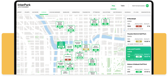
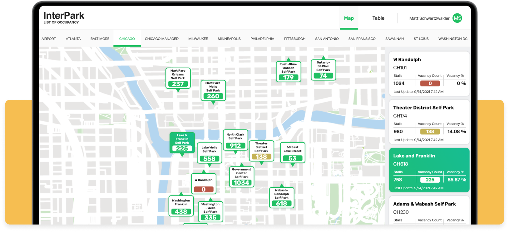
New map UI
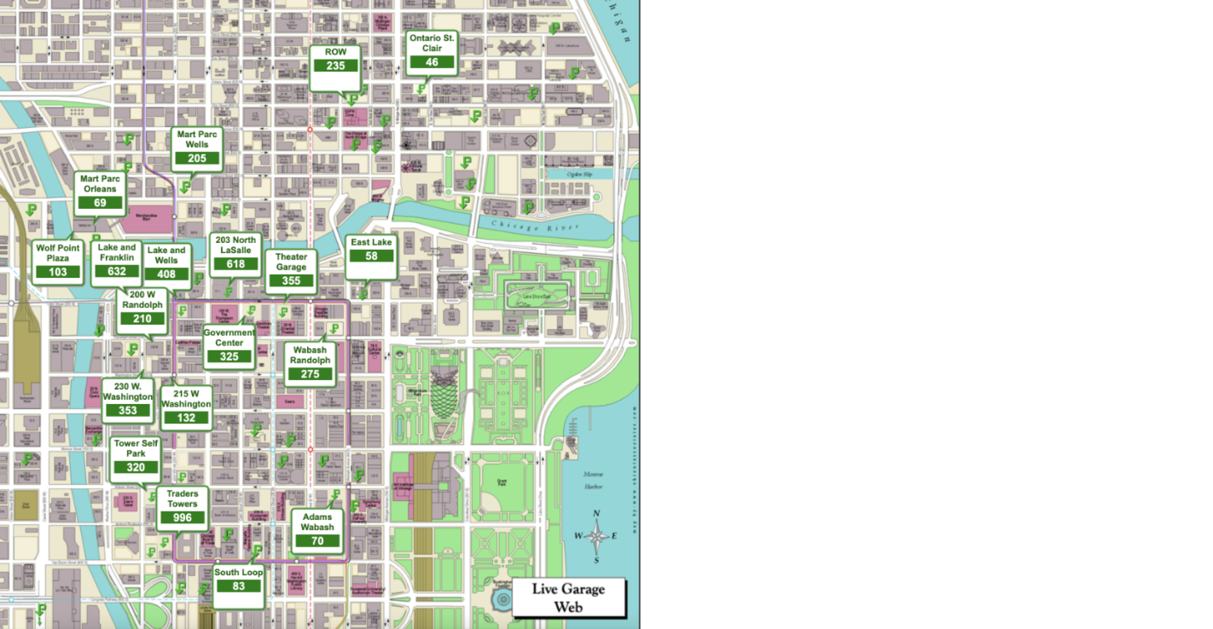
The old Occupancy maps
These maps were not responsive
All maps had a 1x1 aspect ratio, no matter which screen they were on. This example shows the unused whitespace to the right of the map when viewing on a modern monitor.
Cluttered pins
In order to view all of the pins without them overlapping, I had to zoom in pretty far. If you were to look at this map while zoomed out, the pins would overlap, and you wouldn’t be able to read all of the information.

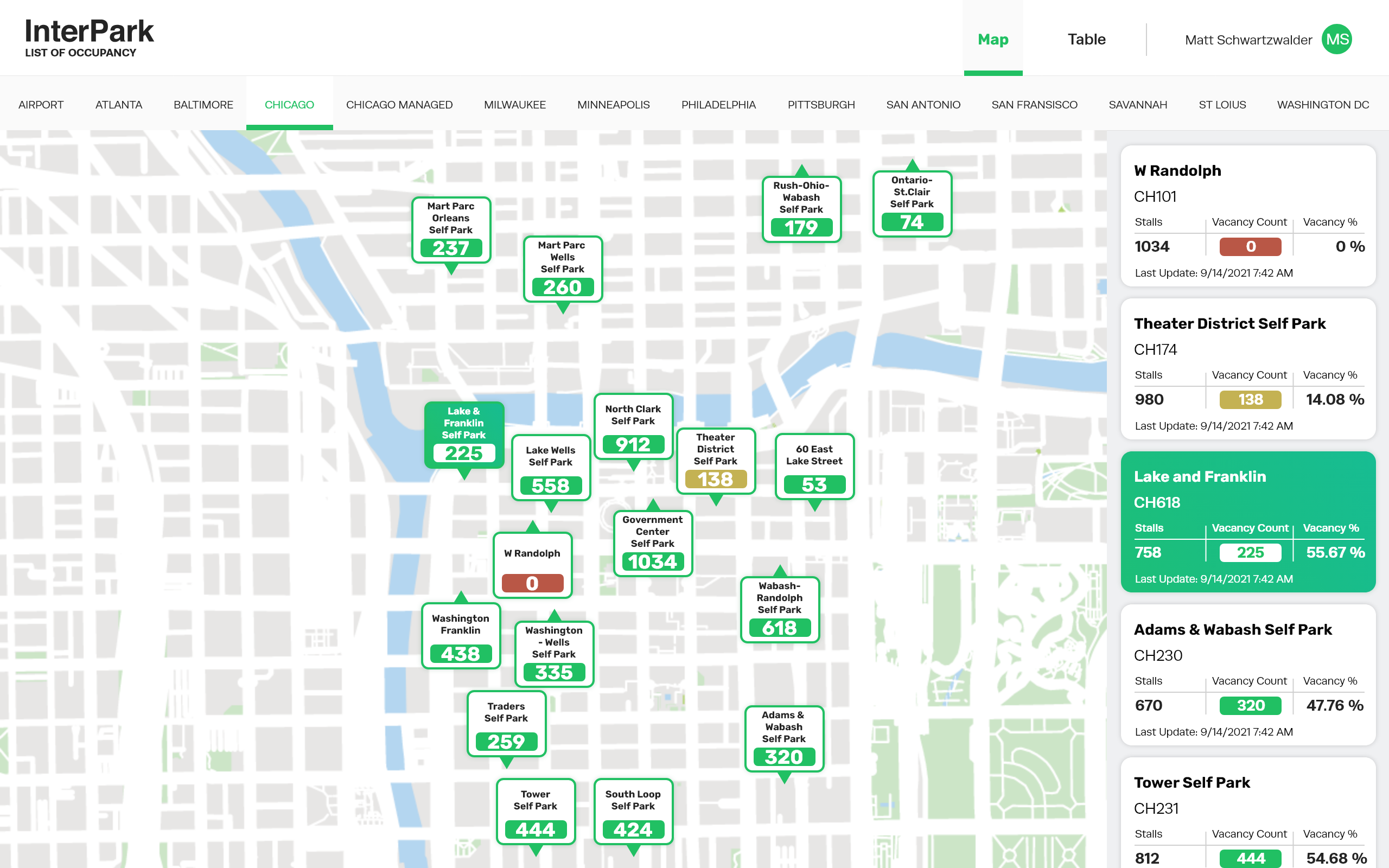
Updated maps & pin styles
The old maps used the Google Maps API, which means iParkit was paying for these maps to be displayed. There was also a lot of useless information and functionality within the maps. The garage management team didn’t need to see each street name because they know where everything is, plus the pins have the garage names on them, which is more than enough for them.
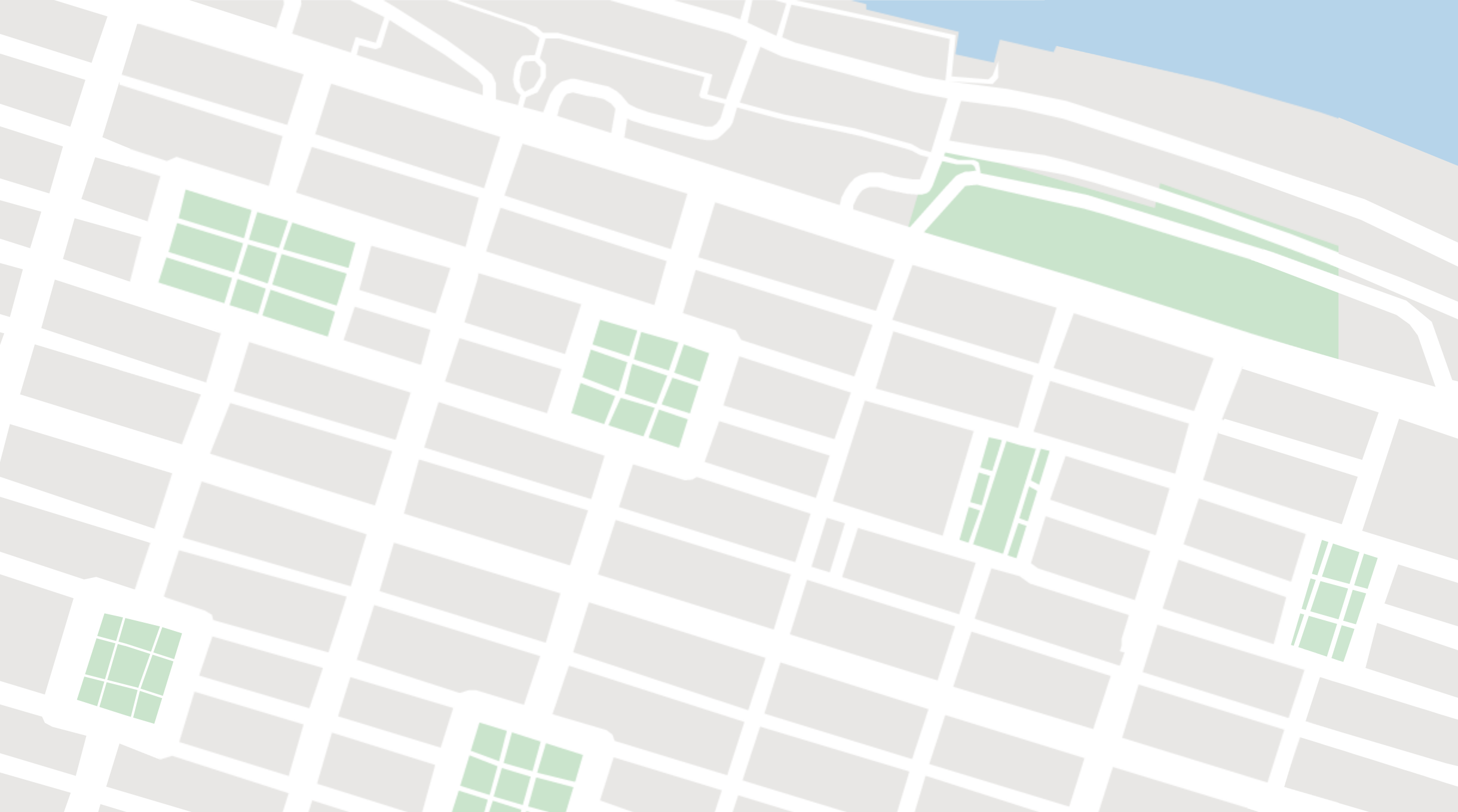
For this project, I drew the maps in a simplified manner. This decluttered the UI and made it easier to read at a glance. Also, by using images for the maps instead of Google Maps, Interpark no longer has to pay to use the Google Maps API, saving them a lot of money.
Redrawn map for Minneapolis, MN

Redrawn map for Savannah, GA
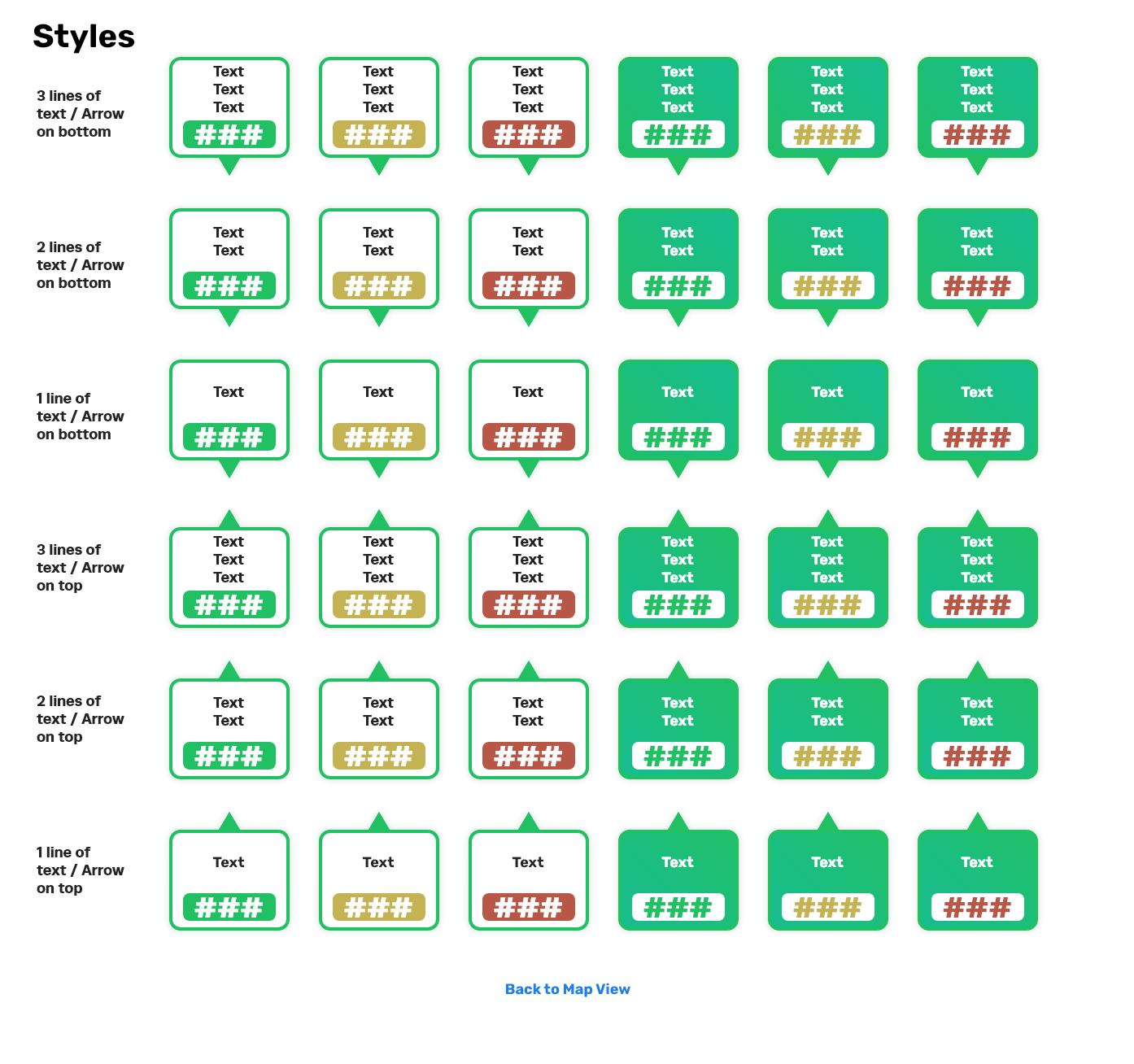
Pin variants for the developers
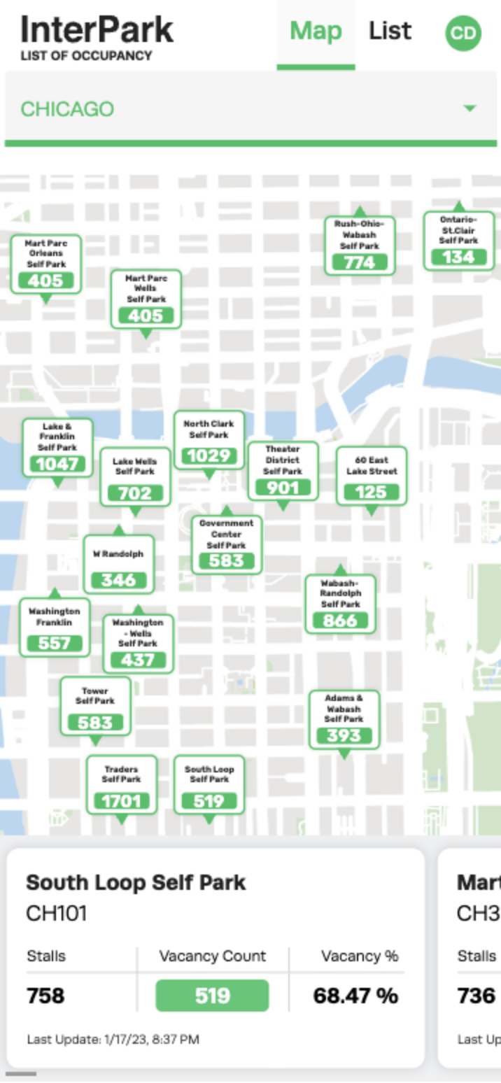
For the maps that are densely packed with garages, like the Chicago map, the pins still overlapped. To solve this problem, I created variants of the pins that could be flipped upside down, allowing for more pins to be placed in close proximity.
Mobile responsive maps
Here’s a screenshot of the redesigned app in production on a mobile device.
A mobile responsive design was a top priority for this project since the garage management team always checked this app on their phones. Plus, it was nice to bring this app into the modern era.
Users can choose which city to view from the drop down at the top of the screen, and there’s a carousel of garage cards at the bottom of the screen that carries the same functionality as it does on desktop. When a pin is selected, the carousel rotates to the corresponding card and highlights it.
Live Occupancy in Action
Check out this video of the newly redesigned Live Occupancy app in production.
Check out the next case study
Saving the USCIS over $400,000 per year
Designing a workflow that saves federal employees hundreds of combined hours per month.
Learn more
Redesigning an old parking map web app
TLDR
The problems: iParkit was paying a costly monthly expense to use the Google Maps API for this app, the iParkit garage management team frequently accessed this non-responsive tool from their phones, and the UI was outdated and cluttered.
The solutions: I drew new PNGs of the maps to be used as static backgrounds so Interpark can stop paying for the Google Maps API, I made the app responsive for mobile devices, and I redesigned the UI elements to reduce clutter and modernize the look and feel of the tool.
Old map UI
New map UI
The old Occupancy maps
These maps were not responsive
All maps had a 1x1 aspect ratio, no matter which screen they were on. This example shows the unused whitespace to the right of the map when viewing on a modern monitor.
Cluttered pins
In order to view all of the pins without them overlapping, I had to zoom in pretty far. If you were to look at this map while zoomed out, the pins would overlap, and you wouldn’t be able to read all of the information.
Updated maps & pin styles
The old maps used the Google Maps API, which means iParkit was paying for these maps to be displayed. There was also a lot of useless information and functionality within the maps. The garage management team didn’t need to see each street name because they know where everything is, plus the pins have the garage names on them, which is more than enough for them.
For this project, I drew the maps in a simplified manner. This decluttered the UI and made it easier to read at a glance. Also, by using images for the maps instead of Google Maps, Interpark no longer has to pay to use the Google Maps API, saving them a lot of money.
Redrawn map for Minneapolis, MN
Redrawn map for Savannah, GA
Pin variants for the developers
For the maps that are densely packed with garages, like the Chicago map, the pins still overlapped. To solve this problem, I created variants of the pins that could be flipped upside down, allowing for more pins to be placed in close proximity.
Mobile responsive maps
Here’s a screenshot of the redesigned app in production on a mobile device.
A mobile responsive design was a top priority for this project since the garage management team always checked this app on their phones. Plus, it was nice to bring this app into the modern era.
Users can choose which city to view from the drop down at the top of the screen, and there’s a carousel of garage cards at the bottom of the screen that carries the same functionality as it does on desktop. When a pin is selected, the carousel rotates to the corresponding card and highlights it.
Live Occupancy in Action
Check out this video of the newly redesigned Live Occupancy app in production.
Check out the next case study
Saving the USCIS over $400,000 per year
Designing a workflow that saves federal employees hundreds of combined hours per month.
Learn more