Saving the USCIS hundreds of thousands of dollars per year by updating an outdated application
(Make new header image)
PLANNING
Was there any conflict during these projects? Did it ever get messy? Where did I need to compromise?
The problem
ROSS is an old federal enterprise application for time tracking and scheduling. It was originally built by engineers with Ruby on Rails without any input from designers. There are many missing features, it can be tedious to use, and it is generally outdated in terms of looks and functionality.
What I’ve done about it
Over the last year, I’ve made many improvements to ROSS by designing new features and redesigning many parts of the existing app. My redesigns save federal employees hundreds of combined hours per day, and their workflows are easier to get through.
(REWRITE ENDING)
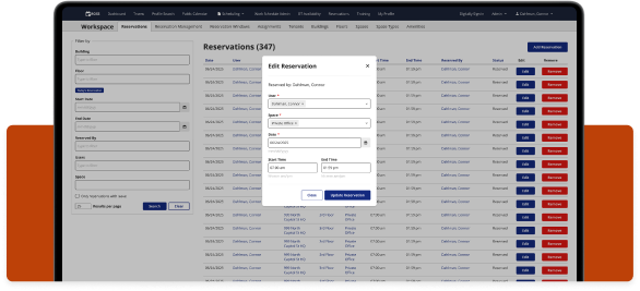
Introducing modals
I redesigned edit and add flows to now use modals instead of going through multiple view and edit pages. This saves a lot of time and frustration.
(Modal images and story)
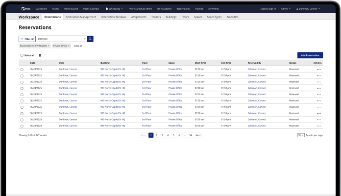
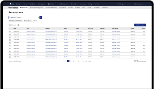
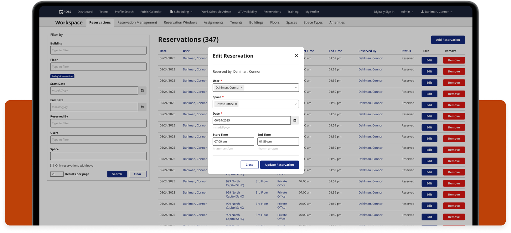
Improving Filters
I redesigned the way filters are displayed to save space on the page. This gave the tables more breathing room and made them easier to scan. The filters were taking up too much room, and according to Matomo, the data analytics tracking app we use, most users only interact with one filter, that is if they even interact with it at all.
(Filters images and story)
Improving tables
I added more functionality to the tables on ROSS, including bulk actions, row actions, and UI updates that improve the readability of the tables.
(Tables images and story)
New admin reservations mapping feature
I designed a new feature that allows admins to view a map of employee reservations.
(Maps images and story)
Disclaimer: All screenshots in this case study are representations of the ROSS application. They include no PII or sensitive USCIS data.
Check out the next case study
Updating tedious workflows for a federal enterprise app
A series of UX improvements for a federal time tracking & scheduling app.
Learn more
Saving the USCIS hundreds of thousands of dollars per year by updating an outdated application
(Make new header image)
PLANNING
Was there any conflict during these projects? Did it ever get messy? Where did I need to compromise?
The problem
ROSS is an old federal enterprise application for time tracking and scheduling. It was originally built by engineers with Ruby on Rails without any input from designers. There are many missing features, it can be tedious to use, and it is generally outdated in terms of looks and functionality.
What I’ve done about it
Over the last year, I’ve made many improvements to ROSS by designing new features and redesigning many parts of the existing app. My redesigns save federal employees hundreds of combined hours per day, and their workflows are easier to get through.
(REWRITE ENDING)
Introducing modals
I redesigned edit and add flows to now use modals instead of going through multiple view and edit pages. This saves a lot of time and frustration.
(Modal images and story)
Improving Filters
I redesigned the way filters are displayed to save space on the page. This gave the tables more breathing room and made them easier to scan. The filters were taking up too much room, and according to Matomo, the data analytics tracking app we use, most users only interact with one filter, that is if they even interact with it at all.
(Filters images and story)
Improving tables
I added more functionality to the tables on ROSS, including bulk actions, row actions, and UI updates that improve the readability of the tables.
(Tables images and story)
New admin reservations mapping feature
I designed a new feature that allows admins to view a map of employee reservations.
(Maps images and story)
Disclaimer: All screenshots in this case study are representations of the ROSS application. They include no PII or sensitive USCIS data.
Check out the next case study
Updating tedious workflows for a federal enterprise app
A series of UX improvements for a federal time tracking & scheduling app.
Learn more